


How to Start Texting Your Customers with SMS Marketing
Why you need and SMS Marketing
Have you thought about adding text messaging marketing to your business? If not, here's something to think about. Emails have an open rate of 20%.
Text messages have an open rate of 98%, and on top of that, 90% of all text messages are read within three minutes of receiving them.
So in this video I'm going to show you how easy it is to get started with text messaging marketing and give you tips and tricks along the way. Hello everyone, Scott Friesen here at Simpletivity helping you to get more done and enjoy less stress. And if you are wanting to engage
with your customers that much more directly and increase your sales, text messaging marketing might be the best solution for you. Whether you want to have a two-way conversation or if you want to communicate with thousands of people at once, text messaging may be the best solution for you.
Text messaging software is easier than you think
In this example, we are using a tool called SimpleTexting which, as the name suggests, keeps things nice and easy for those of us who may not be so technically inclined, but still want to take advantage of the most recent technology including SMS marketing.
So here within my SimpleTexting interface, you can see I can manage all of my conversations here on the left hand side. Here in the middle of the screen, you can see an example of a conversation that I'm in right now between a potential customer.
And then on the right hand side, I can easily view all of that contact's information and include additional details, including notes, birthday, and other vital details.
So here, from the comfort of my own desk, I can text an communicate directly back either with an individual customer or with customers on mass. "Yes, you can come in tomorrow and pick these up."
So I can send my text whenever I need to and keep a complete history of that conversation right here on my desktop. How to acquire your text messaging audience But before we go any further with the specific features, the very first question we need to answer is
"How do we start communicating with our contacts?' And this is very, very important when it comes to text messaging. You must receive consent, or in other words, you must ensure that the people that you're communicating with have opted to communicate with you via text messaging.
And for that, we're going to make use of a keyword. Now, you've probably texted a keyword before, or at the very least you've seen other businesses invite you to text a certain word to their number.
The reason for this is that this is the most common way to opt-in to a text messaging service. So let me show you how easy it is to set this up. In this case, I'm going to select a new keyword. And because my business is all about being simple, I'm going to choose that word "simple."
Anyone who text the word "simple" to this number above will be added to my list. Now I can either choose to add it to a new list or to an existing list, and in this case, I'm going to choose to add it to a new list called Subscribers.
So anyone who texts the word "simple" will be added to this list, and then I'll be able to send them campaigns or specific messages in the future. Now down below, here is going to be
the Auto confirmation message. So what do I want them to receive after they've texted this word to me? And an added benefit of using SimpleTexting is that yes,
they have AI built in. So if I don't want to write the message myself, I can always come up here to Generate message. And so I'm going to give the AI assistant the following prompt, "Thank them for joining the list and stay tuned for special offers."
I can next select Generate a message, and then down below in just a few seconds, it will generate several messages for me to choose from.
Now as I scroll through the selections here, I like this sound of exclusive, it makes people feel special, so I'm going to select that one and say Select message. And of course, I can always continue to edit it or add more details down below.
Remember, you can always add links to your messages. So if you want to direct them to a certain landing page on your website or to another resource, you can do that here as well. But I'm going to keep it rather simple in this particular message. Now, I'm not going to add any further details.
I'm going to select Save this keyword in this case, and here you can see it has been added to my list. Anyone who texts this word to this number will be added to my subscriber list. So let's go and test it out. I'm going to go back to my inbox here,
and on my phone, I'm going to text the word "simple" to this number. Here you can see what I texted, and instantly I received this message back, "Thanks for joining,
stay tuned for exclusive offers and more." And now when I come over here to my contacts, I can take a look at my Subscribers list, and look at that, we have one new subscriber, which would be me and my test account.
So that's how easy it is to both set up a keyword and invite people to join your list.
And don't forget, you can add as many keywords as you want and have them trigger new things, either trigger specific responses So maybe in this case, I have a keyword of "apply" or "jobs", and these are people who are seeking to apply for a position within my organization, something very different than maybe just a general marketing list Getting consent to send text messages Now, adding a keyword is not the only way to have people opt-in to your text messaging list. Another common method is to include it on a form.
So if you're already collecting phone numbers, you can include an opt-in checkbox so that they give you permission to text with them. But here, within SimpleTexting, you can also create your own web signup forms.
So for example, I've created a form called New Customer Form where I can include as many details as I want including first and last name, their email address, maybe I want to capture their birthday.
If I want to send them a special birthday message via text messaging, I can do it all here. I can then send them directly to my form where they can fill out the required information
and then select Subscribe now.And here you can see we have that policy built in
that by selecting this, they agree to receive promotional messages. Remember, in order to keep your number and more importantly your brand in good faith, make sure that you have some way for them to explicitly agree to receive SMS messages from you Creating SMS marketing campaigns But enough about consent, let's move on to one of the most powerful features when it comes to using text messaging marketing and that is creating your own campaigns.
This gives you the opportunity to communicate with thousands of your clients exactly when you want to and have them act on those requests in a matter of minutes. So here I have a number of campaigns set up already, including this 25% Off Sale. So I can see when it was sent,
I can see what the message was, but I can also keep track of that history in terms of how many people received it, I can also keep track of the link that was used and how many people actually clicked that link. But let's go ahead and create a new campaign from scratch.
All I need to do is select this New button here and let's give it a campaign name. I'm going to say "Buy 1 G One", that's going to be the name of the campaign. This is just for my own reference here.
Once again, we can use AI to assist us, but in this case, I'm going to put in my own messaging. So in this example, I've said the following, "This weekend only, Buy 1 course and Get a 2nd course for FREE!
Make your picks now." And then I've included a link to the landing page. Now here on the right hand side of the screen, it's going to give me a helpful preview of what that message will look like. And the first thing that you will notice is that this big, long link
is going to look rather ugly and maybe a little intimidating, and actually maybe take away from the rest of the message. Well, SimpleTexting has a feature called Shorten URL. So all I need to do is select the URL, and I'm going to select that Shorten URL.
And here's an example of what it will now look like to the recipient. Nice and short, the focus is on the message, and they are still just one click away from making their selection.
Now, immediately down below, you will see that there's a section called Unsubscribe message, and this is also a best practice, reminding those whom you are communicating with that they have an opportunity to unsubscribe or stop receiving messages from you.
In this case, the word is "stop", so as long as they text the word "stop" in reply, they will be removed from this list and no longer receive messages. I'm going to come down here and just hit Enter on my keyboard just so there's some separation between that message and the link that I want them to click.
Next, I need to select which group I want to send this campaign to. So I'm going to select this and come down and choose Subscribers. Now, I can choose multiple groups if I want to, but in this example, we're going to stick with just subscribers.
Lastly, I can choose if I want to send this campaign immediately, if I want to schedule it for the future, or if I want to set up a recurring schedule for this particular campaign. In this example, I'm going to stay with Immediately and hit Next.
I am then brought to the summary screen where I can review one last time what this message will look like, and when, I'm happy I can hit Send now, and then brought back to the campaign screen. And if I go back to my inbox, I can see with this test user account
that yes, this campaign has been sent, including this very nice and short and very clickable link rather than the very long and intimidating link that I first pasted in.
Free resources & pricing options Now, if you're still not sure if text messaging is right for your business, SimpleTexting has provided a vast library of guides for each and every industry. So no matter what type of business you are running, you can get started and see best practice examples. For example, maybe I run an accounting firm
and I want to see what others are doing and how they are using text messaging
within their particular business, this is a great resource and will get you off and running in a matter of minutes. In addition, if you are worried about pricing and how much this will cost you, SimpleTexting makes it easy. All you need to do is figure out how many messages you will be sending per month so you'll know exactly how much
you'll be spending in the future. I particularly like their Build a Plan screen where you can type in exactly how many contacts you plan to message, whether you're going to be messaging consistently or maybe just seasonally, and how often per month
you'll be messaging that client as well. This will give you a very accurate number,
so you can eliminate any future surprises. So to learn more and to get started for free, go to SimpleTexting.com or select the link in the description down below.
And if you have any questions, be sure to let me know in the comments. Thank you so much for watching. And remember, being productive does not need to be difficult.
In fact, it's very simple.
Why you need to consider SMS marketing Have you thought about adding text messaging marketing to your business? If not, here's something to think about.
Emails have an open rate of 20%. Text messages have an open rate of 98%,
and on top of that, 90% of all text messages are read within three minutes of receiving them. So in this video I'm going to show you how easy it is to get started with text messaging marketing and give you tips and tricks along the way.
Hello everyone, Scott Friesen here at Simpletivity helping you to get more done and enjoy less stress. And if you are wanting to engage with your customers that much more directly and increase your sales, text messaging marketing might be the best solution for you.
Whether you want to have a two-way conversation or if you want to communicate with thousands of people at once, text messaging may be the best solution for you.
Text messaging software is easier than you think
In this example, we are using a tool called SimpleTexting which, as the name suggests, keeps things nice and easy for those of us who may not be so technically inclined, but still want to take advantage of the most recent technology including SMS marketing.
So here within my SimpleTexting interface, you can see I can manage all of my conversations here on the left hand side. Here in the middle of the screen,
you can see an example of a conversation that I'm in right now between a potential customer.
And then on the right hand side, I can easily view all of that contact's information and include additional details, including notes, birthday, and other vital details.
So here, from the comfort of my own desk, I can text and communicate directly back either with an individual customer or with customers on mass. "Yes, you can come in tomorrow and pick these up." So I can send my text whenever I need to
and keep a complete history of that conversation right here on my desktop.
How to acquire your text messaging audience
But before we go any further with the specific features, the very first question we need to answer is "How do we start communicating with our contacts?' And this is very, very important when it comes to text messaging. You must receive consent, or in other words, you must ensure that the people that you're communicating with
have opted to communicate with you via text messaging. And for that, we're going to make use of a keyword. Now, you've probably texted a keyword before, or at the very least you've seen other businesses invite you to text a certain word to their number.
The reason for this is that this is the most common way to opt-in to a text messaging service. So let me show you how easy it is to set this up. In this case, I'm going to select a new keyword.
And because my business is all about being simple, I'm going to choose that word "simple." Anyone who text the word "simple" to this number above will be added to my list.
Now I can either choose to add it to a new list or to an existing list, and in this case, I'm going to choose to add it to a new list called Subscribers. So anyone who texts the word "simple"will be added to this list,
and then I'll be able to send them campaigns or specific messages in the future.
Now down below, here is going to be the Auto confirmation message. So what do I want them to receive after they've texted this word to me? And an added benefit of using SimpleTexting is that yes, they have AI built in.
So if I don't want to write the message myself, I can always come up here to Generate message. And so I'm going to give the AI assistant the following prompt, "Thank them for joining the list and stay tuned for special offers." I can next select Generate a message, and then down below in just a few seconds, it will generate several messages for me to choose from.
Now as I scroll through the selections here, I like this sound of exclusive, it makes people feel special, so I'm going to select that one and say Select message. And of course, I can always continue to edit it or add more details down below.
Remember, you can always add links to your messages. So if you want to direct them to a certain landing page on your website or to another resource, you can do that here as well.
But I'm going to keep it rather simple in this particular message. Now, I'm not going to add any further details. I'm going to select Save this keyword in this case, and here you can see it has been added to my list. Anyone who texts this word to this number
will be added to my subscriber list. So let's go and test it out. I'm going to go back to my inbox here, and on my phone, I'm going to text the word "simple" to this number.
Here you can see what I texted, and instantly I received this message back, "Thanks for joining, stay tuned for exclusive offers and more." And now when I come over here to my contacts, I can take a look at my Subscribers list, and look at that, we have one new subscriber, which would be me and my test account.
So that's how easy it is to both set up a keyword and invite people to join your list. And don't forget, you can add as many keywords as you want and have them trigger new things, either trigger specific responses or have them added to a particular list. So maybe in this case,
I have a keyword of "apply" or "jobs", and these are people who are seeking to apply for a position within my organization, something very different than maybe just a general marketing list.
Getting consent to send text messages
Now, adding a keyword is not the only way to have people opt-in to your text messaging list. Another common method is to include it on a form. So if you're already collecting phone numbers, you can include an opt-in checkbox so that they give you permission to text with them.
But here, within SimpleTexting, you can also create your own web signup forms. So for example, I've created a form called New Customer Form where I can include as many details as I want including first and last name, their email address, maybe I want to capture their birthday.
If I want to send them a special birthday message via text messaging, I can do it all here. I can then send them directly to my form where they can fill out the required information
and then select Subscribe now. And here you can see we have that policy built in
that by selecting this, they agree to receive promotional messages. Remember, in order to keep your number and more importantly your brand in good faith,
make sure that you have some way for them to explicitly agree to receive SMS messages from you.
Creating SMS marketing campaigns
But enough about consent, let's move on to one of the most powerful features
when it comes to using text messaging marketing and that is creating your own campaigns. This gives you the opportunity to communicate with thousands of your clients exactly when you want to and have them act on those requests in a matter of minutes.
So here I have a number of campaigns set up already, including this 25% Off Sale. So I can see when it was sent, I can see what the message was, but I can also keep track of that history in terms of how many people received it, I can also keep track of the link that was used and how many people actually clicked that link.
But let's go ahead and create a new campaign from scratch. All I need to do is select this New button here and let's give it a campaign name. I'm going to say "Buy 1 G One",
that's going to be the name of the campaign. This is just for my own reference here.
Once again, we can use AI to assist us, but in this case, I'm going to put in my own messaging. So in this example, I've said the following, "This weekend only, Buy 1 course and Get a 2nd course for FREE! Make your picks now." And then I've included a link to the landing page.
Now here on the right hand side of the screen, it's going to give me a helpful preview of what that message will look like.
And the first thing that you will notice is that this big, long link is going to look rather ugly and maybe a little intimidating, and actually maybe take away from the rest of the message. Well, SimpleTexting has a feature called Shorten URL. So all I need to do is select the URL,
and I'm going to select that Shorten URL. And here's an example of what it will now look like to the recipient. Nice and short, the focus is on the message, and they are still just one click away from making their selection.
Now, immediately down below,you will see that there's a section called Unsubscribe message, and this is also a best practice, reminding those whom you are communicating with that they have an opportunity to unsubscribe or stop receiving messages from you.
In this case, the word is "stop", so as long as they text the word "stop" in reply, they will be removed from this list and no longer receive messages. I'm going to come down here and just hit Enter on my keyboard just so there's some separation between that message
and the link that I want them to click. Next, I need to select which group I want to send this campaign to. So I'm going to select this and come down and choose Subscribers. Now, I can choose multiple groups if I want to, but in this example,
we're going to stick with just subscribers. Lastly, I can choose if I want to send this campaign immediately, if I want to schedule it for the future, or if I want to set up a recurring schedule for this particular campaign. In this example, I'm going to stay
with Immediately and hit Next. I am then brought to the summary screen where I can review one last time what this message will look like, and when, I'm happy I can hit Send now, and then brought back to the campaign screen. And if I go back to my inbox, I can see with this test user account that yes, this campaign has been sent,
including this very nice and short and very clickable link rather than the very long and intimidating link hat I first pasted in.
Free resources & pricing options
Now, if you're still not sure if text messaging is right for your business, SimpleTexting has provided a vast library of guides for each and every industry. So no matter what type of business you are running, you can get started and see best practice examples.
For example, maybe I run an accounting firm and I want to see what others are doing and how they are using text messaging within their particular business, this is a great resource and will get you off and running in a matter of minutes.
In addition, if you are worried about pricing and how much this will cost you,
SimpleTexting makes it easy. All you need to do is figure out how many messages
you will be sending per month so you'll know exactly how much you'll be spending in the future. I particularly like their Build a Plan screen where you can type in exactly
how many contacts you plan to message, whether you're going to be messaging consistently or maybe just seasonally, and how often per month you'll be messaging that client as well.
This will give you a very accurate number, so you can eliminate any future surprises. So to learn more and to get started for free, go to SimpleTexting.com or select the link in the description down below. And if you have any questions, be sure to let me know in the comments.
Thank you so much for watching. And remember, being productive does not need to be difficult. In fact, it's very simple.
SAVE a TON of Time with this FREE AI Mind Mapping App
One of the most challenging things with using a mind mapping tool is just getting started. Okay, I'm going to grab this shape here, and I'm going to call this my new idea. And then I'm going to go over here, and I'm going to say that this is step one of that new idea.
This is going to take a long time. Well, what if instead you could create a full mind map, like the one you see here, in a matter of seconds? Let me show you how. (light ting) Hello, everyone.
Scott Friesen, here at Simpletivity, helping you to get more done and enjoy less stress. And, as we take a quick glance at this mind map,
you would probably assume that this took me a full hour, if not longer, to brainstorm.
And maybe I had to collaborate with others and rethink how I was going to group everything together, but I didn't do any of that. In fact, I created this mind map in just a few seconds. So let me show you how.
Create a mind map in seconds
Here, within Miro, I can come up to the Settings icon and select the Command palette. And here I have a variety of AI-assisted prompts that I can get started with.
Now I can do an awful lot, but for right now let's look at generating our mind map.
And so, in this example, I want to generate a mind map for a new pet grooming business and what areas I should be focused on. All I need to do is hit Enter on my keyboard, and in just a few seconds, I have a complete mind map, which is going to give me a variety of different areas, including ones that perhaps I didn't think about,
where I can continue to brainstorm or to edit and group things together.
So, in this example, I've got everything from location to what services am I going to offer, supplies, finances, legal, staffing, marketing, and target market. A number of things that maybe I wasn't going to consider.
Now, just like with any other mind map, I can group things the way I want. If I want some things on this side together, if I want to perhaps make a connection between ear cleaning and shampoo and conditioning,
I can do all of the editing features that I'm used to here within Miro.
Expand your ideas with AI
But our assistance from AI doesn't stop here. Let's come up here to target market. And I want to think a little more deeply about the different types of pet owners.
So I'm going to select this, and you'll notice that we still have this AI icon available to us. If I select this, I can expand and continue down this path. I can either expand with questions, expand with ideas or expand with topics.
Because I'm still in brainstorming mode, I'd like to think of some questions I should be considering as I'm exploring different pet owners. So I'm going to select that option here.
And, again, in just a few seconds, it's going to spit out a number of different questions that maybe I will want to include on an intake form. Maybe it's some questions that I want to ask myself when it comes to marketing and who I am going to be targeting.
These are fantastic questions, and they're very specific to pet owners and things that are related to a pet grooming business. Now, of course, I can come up here and maybe remove some of the ones that I don't think are as relevant, but just look at how quickly I've gone from a very simple idea, a simple set of instructions, into a variety of things that is going to help me set up my business for success.
Beyond mind maps with AI
But, of course, because Miro is such a flexible tool, we are not limited to just mind maps and drawing things with shapes and connecting them with lines and dots.
In fact, one of my favorite features of Miro is using their sticky note feature. So let's see how AI can help us in this context. So, in this way, I want to maybe generate some questions for an upcoming workshop.
So, in this example, I'm asking, "Give me 25 icebreaker questions for a business budgeting workshop." Let's see what it comes up with. And, again, in just a few seconds, it's given me exactly what I'm after.
And, unlike ChatGPT or some more text-based AI tools, it's so much easier for me to group these things together. What I love about sticky notes is that, in just a matter of seconds,
I can group maybe some like-minded questions together. I can, of course, color code them as well if I want to maybe make things that are related to financial lessons in pink. And I can still make those connections as we would come to expect when it comes to any type of mind mapping tool.
Summarize ideas fast
But it gets better than that because, remember, we have AI tools at our disposal.
So, in this example, I'm going to select all of those sticky notes, and I'm going to come up here to our AI tool. I can choose to summarize all of these Post-It Notes, which may be very useful if you are collecting user data or maybe this is feedback from your clients. I can cluster them by keywords or I can cluster them by sentiment;
meaning are they more positive or negative or neutral. In this case, I'm going to choose cluster by keywords because I want to see what some of the themes are
amongst these questions, and maybe I want to make sure that I spread them out
or have a nice mix of these icebreaker questions available. So, by selecting this option, you can see it's grouped it by more expenses, budget and process.
Here is a little more lesson, philosophical. This one is related more to tools or apps.
So maybe, for my upcoming training, I'm going to select one from each of these categories, or maybe for a certain part of my meeting, I'll just focus on all six of these
if we're talking about goals.
Cluster ideas by theme
Now, in this next example, I'm sticking with my sticky notes. And here I've collected
a variety of feedback from actual users who have been customers of a pool company. So I've got a mix of feedback here, which is probably going to take me some time to sift through or go through one at a time.
But, why don't we use AI to make it that much easier? Here, I'm going to use that option again. And this time I'm going to say Cluster by sentiment. Now it has broken out all of those comments
into three categories: positive, neutral, and negative. So let's say I just want to focus
on these negative comments here. What I'm going to do is select five of these comments, and I'm going to say, "Summarize it for me," rather than going through each and every comment.
What is the theme here?Well, "Good customer service but a high price. Excellent recommendations but delivery and installation issues or damage." So think about how much more time consuming it would be if I had a hundred or maybe a thousand pieces of feedback.
Now I can summarize it and share it with my team or act on what I see here. So, if you want to generate ideas and strategies that much faster and with the assistance of AI, be sure to check out Miro.
Miro AI is currently in beta, but available for all users. To find out more and to get started, click the link in the description down below. Thank you so much for watching.
And, remember, being productive does not need to be difficult. In fact, it's very simple.
How to use Gmail + Trello + CRM on Just ONE Screen
I've said it before and I will say it again: please do not use Trello as a CRM unless you are using a particular tool. Trello is so fantastic for managing a variety of projects,
including deals, including a pipeline, and managing all of your sales and contracts.
But out of the box, it is not designed to manage customer relationship data, especially if you want to track that customer amongst multiple cards or multiple boards.
For that, you want to use Crmble; and in this video, I'm going to show you a feature which makes Crmble even better so you don't have to go elsewhere to manage your emails. Hello, everyone. Scott Friesen here at Simpletivity, helping you to get more done and enjoy less stress. And here I am within a sample board,
which I do have the Crmble Power Up enabled. Just as a brief review, not only does Crmble give us a variety of different details within the cards themselves, but it gives us a variety of very powerful reporting features; we can see all of our contacts in a single screen in a single place. This is definitely where you want to be managing
your customer relationships. But let's go back to the board itself, because what is brand new is bringing in an integration with Gmail so that you can not only communicate directly with your customers, but you can see those replies and never have to leave your Trello account.
So, here I've got a sample deal, this Scott Testerson deal. I'm going to click on this. And as you may already know, we've got so much valuable information available to us. We can add that customer card right here.
We can also add other important information such as the size of the deal, where did this potential customer find us, the creation date, what kind of lead is it? I'm going to say this lead is hot, so I can filter that or I can view that in my reporting, and maybe I can also record what is their projected budget versus what I feel the deal is worth,
or what I'm hoping we can sell this contract for. But the new feature, or enhanced feature, is the ability to see our conversation's complete threads right here from within the card.
So, here you can see, when I select the Mail link, down below, I can see a full history of my communication with this client. I can see what has been going on. I can, of course, load more threads if I want to as well. I can either review a previous message, or I can start to compose that message as well.
Let's start by clicking on something that we've already sent. And here at the top of the screen,
we have a nice condensed view of our previous conversations, the back and forth that we've had. So, I can see exactly what was said, so for our next meeting or for my very next email, I can say the appropriate thing.
But the other bonus is that, on the right-hand side of the screen, I still have all of that information available to me.
So, if I need to reference the deal size, if I need to reference when we have started
our communication with each other, or if I need to record if this deal has been won or lost, I can do so here within the same screen as well. I don't need to toggle back and forth or have multiple tabs open at the top of the screen; I can do so right here.
But you'll also see that I can start to compose my message from this screen as well.
So, just below the thread view up top, you can see that we can actually add multiple email addresses. So, this can be great if you are managing your Trello and CRM boards with multiple team members and you want to respond from a particular address, or maybe you don't want to use your personal address, maybe you're chiming in with a different address that you have.
So, you can add multiple accounts here. Here is whom I am sending the email address to. Of course, I'm not limited to that, but because I'm within this customer account, that only makes sense.
And then, we have our subject line, and then, of course, our message down below. And you can see we have a variety of editing options that make it easy to access, so we can start to compose our message.
But all the way at the top of the screen, you can also see that we can create our own Gmail templates, and I don't mean templates that you've created within Gmail; we can create those templates right here from within Crmble.
So, for example, maybe I want to check in; and I've already spent time creating
this template down below. Here you can see I have the appropriate links, I've got the appropriate message, and I even have the appropriate signature down below.
So, I can quickly and easily add this template, come down here, and hit Send.
And I've never had to leave my Trello board; I've never had to leave this card at all.
I could continue to manage this relationship and then see those messages and see those responses down below.
Now, since the Mail link is not open by default when first opening up a card, the deal details will be visible, which makes the most sense, because this is where we have the most important information. But if we scroll down to the Activity window, you can see that it will also record those messages, those emails within the comments.
So, here are the last three emails which I have sent,
including the last one just a minute ago, so you can always reference them here, as well, in addition to the Mail link here. Now, speaking of those email templates,
where do we go to create new ones or edit existing ones? Well, we're going to jump back into our Crmble Power Up, which, again, will not send you to another tab
but keep things here right within Trello. And we're going to come down here to Toppings. Here, you'll see a full list of the additional toppings in which we can integrate with other tools, and I'm going to click on Gmail.
So, this would be the place you go to link your account.And of course, you can add multiple accounts if you wish to. You can also choose if you want to enable or disable Gmail tracking and viewing those Gmail threads.
And down below, you can see the three existing email templates, including this Checking in template which we used a moment ago. But if I want to add a new one, I simply need to select this plus button. and my email editor will be brought to the forefront. So, here I can give it a name; that's just a reference
for myself or other users. And then, down below, the subject line; and then the message itself. And then, once I've saved this template, it will be available to me not only down here, but more importantly, when we jump into our cards. And remember: this functionality is going to be available on each and every one of your cards.
So, if I have yet to reach out to this contact, I can either come here to the Mail link, but don't forget, you can also click this Gmail link directly on the contact themselves. So, their email address has already been input. I'm already halfway there, and I can come in here and start sending that email. Last but not least, one additional bonus feature
is that you can allow Crmble to bring in your default signature from Gmail.This is not something which I've created here within Crmble, it has brought it over directly from my Gmail account. T
here is no need to add or create a new signature here within Trello unless you would like to. Now, if you'd like to see all of the features within Crmble and see if it's the best fit for you and your Trello account, I'd invite you to watch this video next, where I give you a full tutorial and setup guide.
Thank you so much for watching, and remember: being productive does not need to be difficult.
In fact, it's very simple.
How to use the Google Chrome Side Panel (Tutorial + Tips)
What is the Side Panel?
I want you to look up, way up here, in the top right hand corner of your screen.
And you're going to notice something that looks, well, a little bit like a square. It's called the Google Side panel. And this has quickly become one of my favorite features of Google Chrome.
So in this video, I'm going to show you everything you need to know about the side panel, along with tips and tricks, so you can get the most out of this feature. This video is sponsored by SaneBox.
The AI email manager that lets you focus more on the messages that count. SaneBox works seamlessly with your Gmail, Outlook or iCloud account, so you can manage your emails more effortlessly.
Do you want to regain that valuable storage space? Use the email deep clean tool and get rid of the emails you no longer need. Or maybe you're just sick of managing all of those rules and filters.
Let SaneBox do the heavy lifting for you and organize your inbox in a matter of minutes. To sign up for your free trial and get a $25 credit, go to sanebox.com/simpletivity.
Now the Google Chrome side panel is not exactly new but it has been getting some additional attention, along with some new features, year by year. Essentially, by toggling the side panel on or off, you will get this side panel on the side of your screen but have options to a number of different things, including a reading list, your complete bookmarks bar and I'm going to show you why this is actually a lot more valuable than the bookmarks bar at the top of your browser.
Journeys, which you may be seeing more frequently these days
but also some additional features so you can customize your Chrome experience.
Now just before we go into each area of the sidebar,
Settings
let's get comfortable with the basic settings. First off, you can increase the size of the sidebar to essentially, as large as you want. So this makes reading and navigating that sidebar that much easier.
So for example here, if I go into something like my bookmarks bar and I expand a folder or collapse a folder, I've got everything at my fingertips. So it's nice and large, so you can keep it as small or as big as you like.
However, if we come into our Google Chrome settings and then if we come over here and click on appearance, you can also choose which side the side panel will be displayed on. So maybe I prefer it here on the left hand side and have my browser window here on the right hand side. Again, we can still expand it here if we need to.
But you can decide what your preference is, as to where it is located. And just as a bonus tip, if you ever find it difficult to read the font within Google Chrome, under appearance, this is where you would make that change as well.
Alright, so getting back to the actual options that we have here within the side panel. You'll see that there are three.
Reading List
A Reading list, Bookmarks and Journeys. Let's get started with our reading list.
So what this is used for, is when you come across a website, let's go to one of my favorite websites that I like to browse once in a while, lifehacker.com. And let's see here if there's something, "10 Security Settings that Protect Your iPhone from Thieves."
Now, I don't necessarily have time to read this right now but I would like to review it later. Since I'm already on this screen, all I need to do, is select, Add Current Tab.
And you'll see that it's brought in a link right over here. Let's just stay within this site, for an easy example. I'm going to grab something else here. How to financially prepare for your parents or in-laws to move in.
And again, I'm going to select, Add Current Tab. Now if you don't want to use this function here, you can also go to the tab itself and if we right click, you can see here is, Add tab to reading list.
So a few different ways in which you can add it here. But remember, I don't have time to read this right now, so I'm going to close this and get on with the rest of my day. But whenever I want to, I can come back here, open up that reading list and now I'm just one click away from those things that I would like to review.
And better yet, when I'm done with them, I can come over here and cross them off, so I can keep track, if I want to, of a history of the pages or the articles which I've read. I can still go back to them in a single click.
But I can easily separate between the things I have already read and things that I have yet to review. So why is this Reading list valuable?
Well, for many years people have recommended that I use Pocket or Flipboard
or a variety of other tools to capture articles and to capture things and categorize them and use them for later. And while it is true that both of these apps, especially Pocket, have a lot more features available to you, it is another app. It's something else I have to go to. It's another tab or another extension that I have to install.
Meanwhile, this reading list is built right into my browser. So I can access it here.
And I can also access it on my mobile devices as well. So if you're looking for something that is simple and straightforward so you can pin or save articles
and pages for later, do so right here with the Reading list.
Bookmarks
Now next up is, Bookmarks. And you're probably thinking, well, how is this that much more helpful than the Bookmarks bar here on the top of your screen? For many years I thought this was the easiest and the best way to get to places that I wanted to go,
especially with the addition of folders. So I can group a collection of webpages together and go exactly to where I need to. However, you'll notice that you are somewhat limited with the amount of space up here.
And depending on the size of the screen that you're using, your eyes need to shift quite drastically from the left and right hand side. But more than just the real estate, either the lack thereof or too much to scan, there's a bunch of additional features that we can use here with the Bookmarks side panel.
Let me give you a quick example. There are many times where I wish to hide the bookmarks bar up here, for convenience. And I've often found myself coming up here to my settings, coming up here to Bookmarks and unchecking, Show bookmarks bar.
Yes, there is a shortcut key but because it involves three strokes, I have typically forgotten it, so I have to come this way to turn it off.
I'd love to toggle it on or off in a quicker manner. Well, we can do just that with the side panel here. So here you can see, I can enjoy more real estate of the website that I'm on or wherever I am reading.
And I can also include a fuller description of each and every one of those bookmarked pages. In the past, what I have often done with the bookmarks bar, is abbreviated a number of these titles, just so I could fit more on the screen up above.
But I don't need to do that here. In fact, I've got an awful lot of real estate. And if I want to expand that, I can do that here as well. This can also make things easier when you are managing and rearranging your bookmarks,
especially when you're moving things in between folders. So for example, I think I should put Walling under reference but first I need to open up reference, just to double check, okay that is where I want it to be. But here with the side panel,
I can expand or collapse anything I want. So I didn't have to make that extra click.
I can say, yes, I do want to move Walling down there. Perfect. I can group that together. So it's just an easier way to access and manage those bookmarks but also hide them at a click of a button, whenever I want to.
Journeys
Now the third option you will see within the Google side panel, is something called, Journeys. And recently I have been seeing this come up more and more frequently,
including when I am searching for something, especially something that I've perhaps searched for in the past. What Journeys is doing, is creating a bit of a history but it's more than just a history, it's grouping like-minded things together and it's also giving us some suggestions.
So here you can see, this is a much easier way to read my history and see where I have been and what I have been doing. But you'll also notice that down below, it's giving me some search suggestions.
These are not things that I typed in as a part of this history. But these are things that it believes I might find helpful. So under Pocket, maybe I want to search for Pocket App, Pocket Firefox or a Pocket game, whatever the case may be.
But it's grouping things together, as you can see, by the pages or the searches that I have done recently. So I can quickly and easily go back in time. If I want to come up here and use the search bar, I can do that as well. I'm going to type in todoist, for example.
And now everything will come back very, very quickly and easily. So if I want to jump back into something that I had forgotten about or if I want to review something from the past, this Journeys can make it that much easier. What I especially appreciate, is that even if you've gone
down a bit of a rabbit hole, maybe you've been searching on a page such as this, you can see that everything I did within Life Hacker, it's easy to read. I can see the full title and I'm just one click away from those pages that I visited in the past. So this Journeys continues to be developed and built out. Stay tuned for more features in the future.
Bonus Tip
Now one additional feature of the Google Side panel, is that when you open up any new tab, you may be familiar with this Google screen, which will show you either your most recent websites or a selection of shortcuts, which you have already added.
In the bottom right hand corner is this customized Chrome option. But if you happen to be on this page, you'll also see it here within the side panel. Now it doesn't matter which one you select, in fact, I'll just show you, if I collapse the side panel and I select customized Chrome, it's automatically going to expand that side panel and give me some options here.
So if I want to change the theme and if I want to be a little more creative here, I can do so. If I want to go back to a more traditional white background
or maybe I like something like this, that is really going to stand out, I can change my theme or customize it to my own color here. I also have a few other choices as well.
If I don't want to show those shortcuts, I can turn them off, perhaps if I think they are a little too distracting. And I can also toggle between my shortcuts, which you see here or most visited websites.
So depending on what you would like to appear here when you are opening up a new tab within Google Chrome. So whether you want an easier way to pin things to read later. If you want a better way to manage and also access
all of your bookmarks. Or quickly see where you have been and jump back into the action, the Google Side panel is worth checking out and is especially a better solution
for the Bookmarks bar up on top. Now I would love to hear from you next. What questions do you have about the Google Side panel or anything related to the Google Chrome browser? Be sure to let me know in the comments down below.
Thank you so much for watching. And remember, being productive does not need to be difficult. In fact, it's very simple.
Stop Using Labels and Folders with Your Email!
This video is brought to you by SaneBox, more about them a little later on. Nearly five years ago I released this video, "How to Use Gmail filters and Labels," and it has certainly become one of my most popular pieces of content, receiving more than 1.2 million views. Now, no, this is not about boasting about one of my successful videos,
it has to do with the subject matter, specifically, Gmail labels. And here's the truth, I don't use labels, I never have and I don't intend to. And I want you to reconsider
your use of labels or folders within your email account. So in this video, I'm going to give you three good reasons why you should forget your labels in order to spend less time within your email. Hello everyone, Scott Friesen here at Simpletivity helping you
to get more done and enjoy less stress. And here we are inside of my actual Simpletivity business email account. Now, of course, I've masked my incoming emails
to protect any sensitive or personal information, but where I want you to focus your attention is to the left hand side of the screen, here, under labels. You'll see that there is absolutely nothing shown here under my labels heading. Now, there is a more button, and if I select that, you're going to say, "Wait a minute, Scott, you've got labels,
I'm looking at three right now." While technically these are labels, I did not create them, nor do I ever click on them or apply them. These are related to a Gmail extension, which I use, so they can manage when an email is returned to my inbox.
But you'll notice there is nothing here, no other label that I have created. No colors, no special text, nothing that is being labeled on the front of my emails either. So why do I not use any labels at all? Let me give you three good reasons. Number one, labels can be incredibly time consuming. The amount of effort it takes for us to create,
manage review, click, and go into our labels and adjust them or re-edit them, can far outweigh any of the promised benefits of using such labels. Furthermore, there are many of us who get so attached to our labels that we start to drag each and every one of our emails into some type of category.
Now, there may be some argument for this three step process of things that are requiring my action, things where I am waiting for someone, and things that I have completed, but even this type of routine
can waste an awful lot of my time, and maybe more importantly, an awful lot of my energy. I've worked with people who are taking spam emails or in this case, a daily notification and dragging it and putting it somewhere else.
And of course it doesn't really matter where you access those labels, wherever you're going to click or apply those labels, it's requiring an extra step to do so. And the question I want you to ask yourself is, how often do you actually come back here and click and use these labels,
or are they simply a repository, a place where they have a specific color or title attached to them but you don't actually make use of them? And that brings us to reason number two why I think you should reconsider using your labels.
And the hard truth is this, your labels and the emails that are contained within them are not nearly as accurate as you think they are. Now, it is true, Gmail does give us the ability to attach multiple labels to a single email.
This is not always the case with other systems or other email clients because perhaps this email is related to two different areas. So I want them to appear in those areas. But we often put way too much trust
on what is being contained within such a label, thinking, that, well, if we've been diligent and we've dragged everything over and if we always put a label on an email,
everything related to my manager or everything related to something over here should be contained within that area, and that is simply not true. Labels are only as good as the individuals who set them up or the individuals who apply those specific labels, so don't always trust that your labels are going to be representative of everything that that label is listed as. A really good example of that is those
of us who may have a label for a specific customer. So let's say this is going to be a customer name, and this could be a client, it could be some other purpose. And I want to make sure that I can quickly and easily put their information all in one place
and then get to it in just a single click. Far too often I've seen people put their faith
in that this label is going to contain everything related to this customer, or from a particular individual. But really the only way to trust or make sure that is the case
is by entering in the email address itself. And of course, we have much more powerful features here within the search bar if we want to filter it by specific users or by specific timeframes as well. Now, while you might argue that this took me more
than one click to get all of this information, here is the overarching benefit. I know for certainty this is all of the email that I have received for this particular individual. I can go back and still continue to sort, or filter or use some of the other options available
to me here at the top of the screen. And that brings us to my third reason why I feel
that labels are not necessary and often eat up too much of our time. The ability to search for emails within Gmail or other clients, such as Outlook, have become so much more powerful, it is that much easier to get and find what we are looking for.
Getting familiar with some of the basic search functions here within Gmail can not only save you time, but can save you the headache of jumping from this label,
hmm, it's not in there, jumping to this label, still can't find it, maybe it's in this label,
and wasting our effort going through our different categories here on the left hand side. And going back to point number one, sometimes, because we've put in all of the effort and all of the work, we feel that we owe it to ourselves to come here and both manage and search for things within our labels, when it can be so much simpler
for me to simply type in a keyword such as request, and I know that it had an attachment, and now I've narrowed it down to these eight emails. Yes, this took me two or three clicks, but only when I wanted that information. Think of all of the other clicks I saved by not having to drag or apply and put labels on the majority of my emails. Now, the one exception to these three reasons would be if you are using a filter within Gmail to automatically apply specific labels. So for example, here, I wanted this particular email course to not block up my inbox. I didn't want any of those emails to appear here and I wanted to quickly be able to review them here
on the left hand side. So just to be clear, none of these emails had a label applied by me manually. I applied a Gmail filter, so it was looking for specific information, including the combination of the sender, and what was included in the subject line. This can be a helpful way to keep things out of your inbox. And that is exactly where I spend the majority of my time on this video, showing you how to make use of filters
so that you can keep that inbox nice and clean and spend as little time in your email as possible. Now, another great way to leave your labels behind and spend a lot less time with your email is by using SaneBox.
SaneBox creates a number of smart labels for you so you don't have to, and you don't have to manage them either as well. Within Gmail, Outlook, or any email account, SaneBox will create a number of smart labels or smart folders such as this SaneLater, where I can go and review certain emails that I don't want to see within my inbox, but best of all, it learns from me
so I can keep my attention on what matters most, and SaneBox can hide those other distractions or other emails that I don't want to see on a regular basis. So if you'd like to get rid of inbox clutter and spend a lot less time with an email, try SaneBox. Click the link in the description below to get your 14 day free trial and receive a $25 credit
if you want to continue the service. Thank you so much for watching. And remember,
being productive does not need to be difficult. In fact, it's very simple.
How to Add a Form to Google Sites - Tutorial for Beginners
Adding a form using Google Forms
In this video, I'm going to show you how to quickly create and add a form to your Google Site, but I'm also going to show you how to create a more impressive form that looks like this, so you can wow your visitors.
Hello, everyone. Scott Friesen here at Simpletivity helping you to get more done and enjoy less stress. And here I am within my Google Site's account, and I am setting up a website, and what do I need, is a contact form.
And of course, forms can be used in a variety of different purposes,
but let's see how easily we can add a form to our site. So in this example, I've got a special event here, and I want to find out some more information. So I would like to add a form just below these images here. Now, Google Sites makes it very, very easy.
Here, on the right hand side under our 'Insert' menu, all we need to do is scroll down
almost all the way to the bottom, and you can see that there is the 'Forms' option.
Now by selecting this, it's actually going to open up a Google Forms preview. So depending on which Google account you are using within Google Sites, you will see a full listing of any forms which you've created within Google Forms before.
Or of course, we can start from scratch. Now, if you have not yet created your form, you will need to go to Google Forms, and either you can start a form from scratch or you can use from one of their many templates to get started.
And Google Forms gives us an actual customer feedback form here, which is great. So we can, of course, adjust any of the questions, anything that we see here, a number of different templates for us to get started with.
Now, once you're finished creating or editing an existing form, you will see it here, within Google Sites. So for example, here is that customer feedback form, which I just selected a few moments ago. But in this example, I'm actually going to come down to this CRM Intake Form.
I'm going to select it, and down below, it says,
"One has been selected." At this point, I'm going to select 'insert'. As like with other elements, the form will be inserted where the cursor or where the last attention was here, within our site.
But of course, we can click and drag this to any other section or drag it to, let's say if we want to center it here on the page, if we want to center it here on the screen. So now, in just a few clicks, we have our form ready for visitors to fill out.
Now of course, this isn't going to be visible until we hit 'Publish', so I'm going to hit 'Publish', but I want you to be wary of something. If we click on the 'Preview' button and come to this page,
Fixing common form display issues
there is that form, that looks great but wait a minute, we've got this, we've got this scroll bar to the right hand side, and if I don't touch the scroll bar, the 'Submit' button is kind of hidden down below.
This can be very off-putting and not look very professional on your site. So, how can we fix this? If we go back into the Google Site's editor, you will see that yes, that 'Submit' button is still hidden here.
All you need to do is select on the form element like you see here, and now I can click and drag, and I'm going to drag well beyond. I'm going to give it almost a good inch below the last thing that is presented here, within my form.
Now I'm going to hit 'Publish' again and let's hit that 'Preview' button. And this time, you'll see that that scroll bar is no longer apparent, and we've got nothing else that is hidden down below.
So, pay attention depending on the size or the length of your Google Form if you need to make some minor adjustments. Now, although adding a Google Form is very easy and straightforward, there can be a downside to using Google Forms.
Number one, you are very limited with the number of editable options available to you. Other than changing the background of the form, and this highlight color, and the color of the button, the layout of your form is very, very standard.
Creating better-looking forms
So how can we make something that is a little more impressive and fits better with your website? Well, I think one of the best ways to both impress your visitors, but also keep them more engaged is by creating a sliding type of form, like you see here.
So I've got a great big invitation to start on this particular form.I'm going to first, enter in my first name. I'm going to go next. Let's enter in a fake email address .com and we're going to hit 'Submit'.
And I even get a nice professional "Thank you," with this graphic here as well. So what am I using and how can you include this within your Google Site? For this purpose, I'm taking advantage of JotForm, a much more robust and powerful form builder, which is still super easy to integrate with your Google Site.
Here, within JotForm, you can create any number of different forms and know they will not look static or standard. And on top of that, you can customize it to your heart's content, whether you want to choose a preset theme, or you can customize virtually every single color element here, on the screen.
In addition, you can add payments to any of your forms and a number of advanced features, including signatures and even the ability to book an appointment. But in our example, let's keep things relatively simple.
I've got a welcome page at the beginning, I've got the thank you page which we've already seen, and here are the only two things that I'm asking for people to fill out. When I'm ready to add to my site, 6all I need to do is go to the 'Publish' area and I'm going to choose this second one, which is called 'Embed'.
Here, I'm going to select 'copy the code', it's automatically copied to my clipboard,
and then I can return to my Google Sites editor. In this example, I'd like to include this form between the RSVP button and these images down below. So no, we are not going to come down to 'Forms'. Instead, we are going to select the 'Embed' button
at the top of the 'Insert' tab. Here, I'm going to select the 'Embed code' option and I'm going to paste in the code which it gave me. I'm going to select 'Next,' and it's going to give me a preview of what that form will look like.
Now, I can select 'Insert' and there it is, exactly where I want it to be. And just like with other elements, we can move it to other parts of our page but I'm also going to choose to actually expand it out, so it actually has the width of most of this page.
It's still centered, but it's going to take up most of the width here. Now, I can hit 'Publish' and the next visitor to my website will see a much more engaging way to interact with my site.
To learn more about JotForm, go to jotform.com or click the link in the description down below so you can start creating fantastic looking forms and add them to your site in just minutes.
And if you're wanting to create a free mobile app to go along with your website, be sure to watch this video next, where I show you how to create one step by step.
Thank you so much for watching, and remember, being productive does not need to be difficult. In fact, it's very simple.
This FREE App Turns Trello into a Full-Service Help Desk!
Easy support system
Would you like to make it easier for your clients to connect with you and would you like to make it painless to manage that entire client relationship and respond to requests and services all within Trello?
Well, in this video I'm sharing with you a free Trello power up that gives your users an amazing experience and will also allow you to save so much time. We're taking a look at a power up called Hipporello, which yes,
gives you a complete customer portal experience like the one you see here, so that your clients are not only going to be impressed but makes it easier for them to connect with you.
Now, Hipporello is a creator of several different powerups including Hipporello apps, which allow you to create your own custom apps right here for Trello. But for this video, we're focused on the Hipporello service desk so that we can respond to support, complaints or create any number of forms which we would like to manage right here within Trello. With the Hipporello powerup installed, you'll see
that we'll have some additional options here in the top right-hand corner. But before we go into the details of how you can set up and manage your own forms and how clients connect with you, let's take a look at the customer experience.
Custom customer portal
Hipporello allows us to create a customer portal like the one you see here. So you can present your brand in a professional manner and go beyond just giving them an email address or a simple Google form.
In this case, I can add my own branding, my own logo, my own color scheme and add as many different forms as I like.
You can also give your users a handy search bar so if you have a number of different forms to look for, they can find it easily and you can have those forms listed here all within the same page. So in our example, I'm going to pretend that I'm reaching out for further information.
I'm going to select this Contact Us form. Now keep in mind you don't have to use the customer portal as you see here, you can create your own custom forms and then embed them directly on your website. So in this example, I'm pretending to be a customer and I'm wanting to find out some more information
about their new features and some of their new pricing plans, at this stage, I'm going to hit submit. Now you're probably used to receiving something that tells you thank you for submitting or we'll be in contact with you shortly, but this is where Here, I can either submit another new request or I can view the request details, and this is what takes your level of support to the next level.
'Cause not only does the user have complete access to what they submitted, when they submitted it, they'll even see the automated response. Here you can see that an agent has already sent an email thanking them for contacting us and telling them that this particular request has been opened.
But up above we can go even further and share this request with someone else. We can give it a rating in terms of how satisfied we are with this request, and if I want to follow up, I can reply to this request directly from this screen.
So instead of some other customer service forms where the user just hopes that that message was delivered and that it was created, you can reassure your clients that you are on top of their request or their application or their feedback 1and they can also keep track of it themselves.
Keep it all within Trello
But let's jump back into our Trello board here. Within Trello, you can see that that new request has appeared within this specific list. I've told Hipporello, anyone who fills out
that Contact Us form, I want it to appear under new requests. And Hipporello also makes it very easy for us to see which ones have been responded to and which ones in which we are waiting for a reply.
So for example, for these two messages, you can see this blue label which says auto messages sent. So yes, we immediately sent a message telling them that we have received the request but we still need to carry it forward, elsewhere, You'll see that we are waiting for a user to reply.
We've already responded to these particular requests and in this job application example, we can see that the user has replied and is now waiting for a response from us. But let's open up these cards to see how much more additional detail that Hipporello gives us,
here within the Trello card itself. Under the description, we have the entire message
including name, email, address, and what they wrote but it's down below where the true power of Hipporello becomes so apparent because not only do we have all
of the tracking information, including the rating that that user gave us, but you can see that we can also reply to this message directly, that's right. No longer do I need to jump back to my email account, no longer do I need to copy and paste this email address or set something up in a CRM system.
I can go right here within my Trello card and hit the reply button and now I can quickly and easily respond to this message.
Now that I've sent my quick reply, I've got a full record of what is being shared. Here is my response to the client and I can also see if they have read
or not yet read my message to them so I can keep track of the entire customer relationship right here within Trello without having to use other details.
Settings and form setup
Now that you have a better understanding of how Hipporello works, let's take a look
at some of the further settings and how you can adjust your forms, by clicking
on the Hipporello powerup in the top right-hand corner, we can access our hip admin account. And remember, you are going to stay right here within Trello, not having to manage multiple tabs or logging into a separate account.
Here under the form to board tab, you can see the list of all of my forms including a bug tracking form that I currently have disabled. But here is that Contact Us form for example
and if I come over here to Actions and select Edit you can see the additional features that we have available to us. So for example, if I select Edit Form, you can see how easy it is to create and customize your forms.
On the right hand side, you can simply drag and drop a long list of different features a long list of different options available to you.
So for example, if I want to add a select box under email, I just need to click and drag and now I can start asking additional questions and giving them additional options. So whether you are creating a form from scratch or editing a template
or copying a previous form, Hipporello makes it super easy for you to create something customized just for your purposes. But in addition to just creating the form, you can set different levels of access and other automations, here under Set Access Policy.
I can customize as to who has access to this form, since this is a general contact us form, I've set it to public, but if I open up a signed policy, I can create a private policy so that perhaps only email domains ending in a certain domain can have access to this particular form.
This is a great feature if you are wanting to use this for a select group of customers or if you're wanting to use it for internal purposes. We can also create other automated rules such as which message gets sent as soon as the form is submitted.
And if you want to add other automation or other triggers, you can do so here as well.
Lastly, if you don't want to use the customized Hipporello customer portal, you can choose to add the embed code. So if you want to take any of these forms and simply put it on your own website, you can do so and take advantage of all of these additional features as well.
Email integration
But keep in mind that Hipporello is so much more than just forms and if you want to
use their email to board feature, you can do so as well. Perhaps you already have an email address that starts with support or help or maybe you want to create one from scratch.
In this example, I've created a custom support email address so I can hand this out to my clients or maybe I can add it as a part of my email signature so they don't always have to use the form or not use the form at all.
Here within my email account, I've pasted in that support email address and I'm pretending to be a customer who is wanting to learn more about their features. Now jumping back to my Trello account, here, you can see that that request appears in that same dedicated list.
So now I can start that conversation with this new user who didn't use a form, but simply use the email address and here's a bonus feature that I really love
and will save you a lot of time. You can create your own quick text right here within Hipporello, so if you have a number of canned responses or templates you'd like to use. here I am just one click away and now I've got that response directly within the message.
All I need to do is hit submit and now I can move on to my next request or next task right here within Trello. So if you'd like to provide the best customer service possible and keep it all within Trello, be sure to check out Hipporello at Hipporello.com or click the link in the description down below.
And if you're wanting to get even more out of Trello and save time, be sure to click on this video next where I walk you through the most powerful Trello automation.
You Need These ChatGPT Chrome Extensions Now!
Better than Google search
ChatGPT continues to change the way that we work and how we do business, but you don't always have to be here within the ChatGPT interface. In this video, we're going to take a look at three ChatGPT extensions, which make it so much easier for you to take advantage of AI. And we're going to get started right here within Google.
Why? Well google is still the number one website in the world. Why? Because we like to find out about things and search for new ideas. So in this example, I'm going to give it a question. When is the best time of year to raise prices for a service?
Let me go ahead and head enter on my keyboard. And of course, Google is going
to come up with a number of answers. Or are they, this is a blog post here. This looks like a blog post. Maybe there's something interesting within this Harvard Business Review and we've got this dropdown menu.
But wait, what do we see here on the right hand side? Well, I've installed a extension called ChatGPT for Google, which will give you a ChatGPT response for anything that you search either within your own address bar or within the standard Google search bar.
And here you can see this is a much easier way for me to digest and skim and summarize some of the five key points when it comes to increasing prices rather than me having to go in and out of all of these articles here on the left hand side.
And let's be honest with things such as MailChimp, Fresh Books, Forbes Magazine many of these are going to be sponsored or maybe skewed in some way. Instead, I can find information which is taking a variety of different sources and giving me a fantastic summary.
But there's additional features we can take advantage of here as well. One of my favorites is the ability
to instantly copy this answer in a single click. So no longer do I need to take my cursor and copy the section that I want. I can copy the entire answer in simply one click. In addition down below, I can continue the chat down below.
So here you can see that there is a Let's Chat button. If I select that option, I could say, now tell me the cons of raising prices. And remember, it's going to keep in mind everything that it just told me up above. It's not a new conversation.
am continuing the conversation that I started and I didn't have to go anywhere else. Now, if you want to tweak some of the defaults for ChatGPT, you can come here into the gear icon and here at the top of the option screen, the trigger mode is what I think is most important.
By default, it is always going to be on meaning. Anytime that you search within Google it is going to give you a response. But if you would rather only have it give you a response when you end it with a question mark you can choose this option here.
Or lastly, you can choose the manual option as well. So if you don't want this being displayed for each and every one of your searches you can customize it for your needs as well.
Use AI with your email
Next up, let's take a look at an extension which also has some of the similar features of our first extension. But where I think it really shines is when it comes to handling your email. And for that, we're looking at an extension called Chat Sonic.
So here is something which is often a burden for many of us and that is both reading and replying to email messages. And if we can use some AI to help us get through our inbox that much faster and also perhaps sound a little more professional or maybe help us to deal with an angry customer, well all the better.
With Chat Sonic, you'll see that there is a little icon here at the top of the screen, but in my first example we're going to take a look at a reply. So here's a fairly simple message which I've received.
I'm going to come down here and hit the reply button, but you'll notice that things look very different down below. First of all, you can see that there is a brief reply prompt here, and all I'm going to do is give it some very basic information.
I'm going to say it will arrive Friday. That's it. That's all I'm going to say. Now, of course, there is no way that I would reply this way to an actual customer. I need to show some more caring. I need to show some more specifics when it comes to replying to this request.
All I need to do is come over to the right and select reply and Chat Sonic will quickly give a professional response complete with the details that I've added here. Now, a couple of great things that can cut down on time. You'll notice that I can change
the tone of this message as well. So if I don't want to sound quite so positive I can select neutral and then select reapply. And it will just slightly change the tone of this particular message.
But remember, it has addressed everything up above and it's included the shipping date which I stated here with. It will arrive on Friday. So not only can you play around with the tone, but even if I leave it at neutral, I can hit reapply
as often as I like, and it will continue to adjust and slightly modify the message below
until I see something that I like. But probably for efficiency, it would be better just to change some single words that you would like before hitting the send button. This might just be the fastest way to reply and or create your own messages.
If I come up here to compose, you'll see that we still have that CS, that Chat Sonic logo here as well. So I'm going to select that. In this case, I'm going to say write an email to my VA about our meeting next Monday something along those terms there.
And here you'll also see that we still have that tone available to us. In fact, within this dropdown
we have many more options available to us as well. Since I'm discussing something with my virtual assistant I'm going to say casual in this case. And I'm going to select write.
And not only will it write the message itself but it will also include the subject line above as well.
But there's one more killer feature which can help you save a whole lot of time especially if you haven't been in your inbox for a while, or if you see a message like this, which has a lengthy thread. Now I realize five emails actually isn't
that lengthy but I'm going to use this one as an example. Let's say that I've just woken up and started into my email and there's been a bunch of back and forth from my other coworkers or clients that I haven't yet seen, or worse yet, what if I come back from a holiday or vacation and there's a number of messages in a lengthy thread?
Well, if I open this up and start to expand it, there's an awful lot to get through here.
These are lengthy emails with a lot of detail. But if I come back to my inbox, what if I could find out what was going on in that email without even having to open it up?
Here again, you can see as I hover over each message, there is that Chat Sonic logo.
And if I select it what it's going to do is give me an executive summary of the entire thread. So in just a moment here, I've got a single paragraph which is telling me exactly what happened throughout the entire thread, including who said what and what the final outcome was here.
Now, rather than reading something that was at least six times this length I've got the entire message here at my fingertips. You'll notice that it also has a tab called timeline.
So if I want a quick recap as to when these messages were sent, I can do so as well. But coming back to the executive summary, an added benefit is that I can come down here and select reply. So I don't even have to go into this message or into this email.
I can reply with a thoughtful response or continue to use Chat Sonic and give an AI reply or at least get me started with my response.
Most powerful ChatGPT prompts
Now, the last extension on our list is going to bring us back to the ChatGPT interface, but for good reason it is going to turn our regular ChatGPT interface from what you see here into something so much more powerful.
What we are using is an extension called AIPRM for ChatGPT. And what this is all about is giving us a number of much more detailed prompts so we don't have to give so much instruction and we can take advantage of some very complicated prompts for our business purposes.
So here you can see I've got a number of different prompts available to me here
including the ability to write an optimized article, the ability to create a buyer persona, for example. And all I have to do is give it a few pieces of information.
So for example, maybe I want a monthly content calendar and I only want to do it in as few clicks as possible. All I need to do is select this prompt here. And now down below you can see that title has been input.
At the very bottom where the cursor is displayed it's going to tell me what type of information it is looking for. So what is the primary keyword that I want to create content for? Well, let's say that I am a cleaning service agency.
That's the keyword that I'm looking for. Or let's just say cleaning services in this case and I'm going to hit enter. So all I had to do was give it two words
but what it is going to do is give me a number of content ideas so I can plan for the coming month or maybe several weeks in advance. So immediately it's given me a nice table which has given me a number of fantastic titles, a number of fantastic themes that I could turn into a blog article, a social media post.
Many of these could be a YouTube video if you wanted to a number of fantastic ideas. And all I had to do was type in cleaning services. If I come back to the top and select new chat, once again I will be given this full list of prompts.
Now, you'll notice that there is over 2,500 different prompts. So what you're going to want to do is use this search bar in the right hand corner. We've already seen this buyer persona legend, but what if I type in the word persona again and hit enter? You'll see that there's actually 65 prompts
that are related to a persona. And within each prompt not only will you be given a brief description but you'll also see how many people have viewed it, how many people have actually used it, and there's also a thumbs up, thumbs down.
So how many people have voted on it as well? So in this case, why don't I stick with the one with the most votes, this buyer persona legend. I'm going to click on it and down below, again, it is only needing some very simple information.
Keep in mind that this prompt contains an awful lot of detail, and not only would we waste a lot of our time trying to include that detail, we probably couldn't come up with the same results.
So this is the real power of the AIPRM extension. So what does our business sell?
I'm going to say that we sell business consulting to bookkeepers in, and let's say Orlando, Florida. I probably didn't even have to say Florida but I'm going to say Orlando, Florida. And in a matter of seconds it's given me a complete user persona
something that I can start to use either for my own marketing purposes or maybe I'm researching for a client. So here I've got a complete demographic with name, age
annual income, even their family or marital status. Down below, I've got further information including things such as their personal aspirations or their biggest pain points. I've got information on their shopping behaviors including some of their preferred brands, and maybe some of the search terms that they use most often.
So this can be a fantastic starting place for creating a user persona or using this information with the clients that you serve. Now, to get started with any of these extensions be sure to check out the links in the description down below.
And if you have further questions about AI or ChatGPT and your business, be sure to let me know in the comments.
Thanks so much for watching, and remember being productive does not need to be difficult. In fact, it's very simple.
Impress Your Clients with this Beautiful Work Sharing App
If you want to really impress your clients and those you work with you know how important it is to stay on brand. But that can be really difficult with our project management and other productivity software.
But what if you could turn something like this into this complete with your logo, your colors and everything else that you would like to customize including the ability to hide certain menus so you're only sharing what you want to share? Well, in this video I'm going to show you exactly
how to do that with one of my favorite tools.
Walling Features
Now, Walling has been one of my favorite productivity tools for a while. Why well number one, they have a free Forever option which has very few limitations. And number two, it has such a frictionless way to add your ideas and your information.
Here I am with a brand new wall and if I just double click anywhere I can immediately start to type in my new idea and other details that I want to share down below. But the great thing is that I'm not just limited to text or checklist or to bullet points.
If I want to quickly grab an image, all I need to do is grab it, drag it again wherever I want to and I easily have that image available to me. What about if I just paste a link? Perfect, now, I've got direct access to this website as well and everything is click and drag.
So if I want to easily group things together I can do that right here within Walling as well. The other feature that I love is that we can create as many sections as we need to.
So maybe down here I'm going to add some tasks and in this case, I'm going to make it more of a KanBan board so I can quickly and easily create as many different sections as I like without having to jump to different pages on my screen.
Public Sharing
But let's get back to customizing how Walling will look for others. Another one of my favorite features is that if I hit the share button here, I can create a public shareable link, meaning I can copy this link and share it with others where they will not have to log in.
I can keep them up to date with what's happening with this project. They can see where things are at, but they don't need to create their own login. They can quickly and easily access this same information.
But recently, Walling has added the ability for us to customize our wall. So if I select this option here,
Logo
we will have the same wall open up, but now we can go ahead and customize to our heart's content. Let's get started with the logo. So I'm going to come up here and I'm going to add a logo from file. So in this case, I'm going to add my Simpletivity logo.
I'm going to add this one here, but because it's a white logo I can't see it, so I better come down here and change the wall background. So maybe I want to use this darker shade of blue.
Perfect, now, we can see my logo and I can come up and change the position or the size as I like as well. I particularly like my logo in the middle here and maybe I'm going to reduce it just a little bit so it's slightly smaller.
If you have a cover image you can choose to put it above or beneath, but in my case I like to keep things nice and clean.
So I just have the logo up here. Of course, Walling gives us a number of different creative ways for us to lay out our walls and if I want to include that wall cover, I can do so here but in my case, I'm going to keep that hidden so it's nice and clean with those who I'm going to share with.
In addition to changing our wall background, we can also change the default color of our bricks and all of the text as well. So for example, maybe I want the background color of my default bricks to be a bit of a green shade.
What I'm going to do is come up here and I'm going to choose this green color and maybe we're going to do something a little bit lighter
something in that tone there. So again, I can customize to my heart's content and if I want to change the text color, I can do so as well. One of the most helpful things you may want to alter is your default text font. S
o for example, maybe I want this to stand out a little bit different than the other fonts or the other text on screen. I'm going to come down here and choose the Rubik font and I'm also going to make it stand out a bit more by making it a little bit larger.
I can of course change the fonts for the other bricks and section titles as I want, but in this example I'm going to keep them as is.
Now, the next two sections on our customized tab are really going to help us choose what we want to show and display and how it looks to those
Customization
who are going to get access to this public link. So for example, do I want to allow them to both add and view public comments. With this ability here, the user will have the ability to add a comment themselves but if I only want to give them read-only access I might want to toggle that to off.
And then down below, we can customize a little bit further in terms of the look and feel and also what they'll be able to see.
So if I want to change my Brick corner, something from something sharp to maybe something that is extra rounded, I can do that here. Do I want to display the wall members or do I want to keep that hidden as well? In addition, I can review other options such as the wall search function or if I want to change or hide section headers and section numbers.
Themes
Now, when I'm finished customizing my wall, I'm going to come up to the very top.
You can see that it has changed this to this custom profile. Before I'm done, I'm going to want to save this as a theme. So maybe I'm going to call this my green theme in this case and I'm going to hit the save button. This is going to be extremely helpful
so that I can quickly and easily apply the exact same theme to as many other walls as I like. And here you can see I've already created a few other custom themes.
So if I want to go back to this simple blue, I can do so but maybe in this case, I want to stick with my green theme. If you don't want to customize on your own, Walling also provides us with a number of presets as well. So here I can choose this matrix style
or maybe I want to be really bold and choose this orange option as well. So you can either customize or use one of the other options to your heart's content.
Sections
But just before I proceed and sharing this link with an external client I want to look at one other new feature. And that has to do with sharing particular sections. Within each wall, you can create as many sections as you need. And in this example here,
my last and final section is a task list. But perhaps I don't want to share this with my client. This is only for internal purposes, but all of the other sections I want to make available. If I click on this share button again, I can select all sections. And here I'm going to uncheck my tasks.
Unchecking sections
So now when someone views my customized wall, they will have no idea that there is a missing section or certain sections which I've kept hidden. This gives me the flexibility to share only what I want and to display it in the way that I want with those who I share externally.
So if you're wanting a better way to visualize all of your ideas and projects and share them with others go to Walling.app or click the link in the description down below.
And if you're wanting to learn even more of the fantastic features within Walling, be sure to click on this video next where I give you a complete walkthrough of this amazing app.
Every Accountant and Bookkeeper Needs this Amazing FREE App!
If you're an accountant, bookkeeper, payroll professional, or just deal with financial software, this free app might just change everything.
Why? How often have you had to show a client how to do something within QuickBooks, Sage or some other accounting software because they only need to do it once in a while and you have to keep repeating yourself and explaining the process once a quarter or once for every new client.
Well, what if instead you could send them a beautiful user guide that looks like this and only took you a total of 41 seconds to create? And yes, you only have to create it once and then you can share this with as many clients as possible.
What we're doing is taking a look at a free app called Scribe, the easiest way to create user guides whether that's for your clients or maybe even for yourself or other members of your team.
So let's take a closer look at what Scribe is and how easy it is to use. Scribe produces a easy to follow guide showing us step by step what the user needs to do including where they need to go, where they need to click and even highlighting on screen what they need to do.
But best of all, I didn't create any of these titles. I didn't add this little orange circle. I didn't tell it to click here. In fact, all I had to do was go through this process and just do it myself once and in a matter
of seconds it's produced this professional looking guide. But better yet, now I can go
and share it with as many clients as I need to. I can send it directly in an email.
I could add it to my website so that all of my clients can take advantage of this particular process but Scribe has gone one step further. If I come over here and select guide me what it will do is actually open up my QuickBooks account so I can follow along.
How easy is this to have the user guide on screen so I can follow along?
So yes, I've logged into my QuickBooks account. I need to come up here and select new and then it's telling me to select journal entry and then I need to come over here and select US dollars. I have the complete user guide on screen so I can follow along while I'm in the application itself.
Now if I need to, I can always minimize this if I want to just focus on my QuickBooks account here and I can pop it up whenever I need to.
Scribe also gives me the ability to move this to the other side of the screen. So if I need to focus on something over here but what a fantastic way to follow along these steps that maybe I only need to do once a quarter.
But best of all, you look like the amazing service provider because you are the one who's created this easy to follow user guide. So let me show you how easy it is to create your own Scribe.
With the Scribe extension installed, you'll find it here in the top right hand corner of your browser. And all I need to do is click on that to start my own recording. But just before I do, I want to show you something really cool.
Here you can see that there are already 58 other Scribes that are related to QuickBooks. If I select this option here, I can view from the gallery. And here's just an example of some of the other guides that are already created, meaning you might not even have to create the specific guide.
You might just be able to share one of these other ones that have already been generated. But let's go back and create our own guide from scratch. So all I need to do is select start recording and now it is recording everything within my browser.
Now on the bottom left hand corner you can see that these are the controls letting me know that it is recording my actions. Now you'll notice that there is no timer on screen and that's for a reason because it has nothing to do with how long it takes me to record this Scribe. It is only recording my actions so I can wait and delay
and wait for something to load or a report to generate. It's only going to record the things that I click or things that I enter in. So let's follow along with our previous example. I'm going to click on new.
I'm going to come over here and select journal entry. I'm going to come to this dropdown and select US dollars and then I'm going to come over here to the journal number and I'm going to change that number.
And maybe as a last step, I'm just going to pick the right account that I want them to find.So there's the Wise account. At this case, I'm going to stop my Scribe in our example.
All I need to do is come down here and select the controls and I can hit this complete recording option. Now, the other options available to us we can always pause our recording if we need to set up something in advance.
We can of course delete this Scribe and start again. For pro users, there is a smart blur feature and this may be helpful to you when you're dealing with sensitive accounting information.
Remember, everything that I'm showing you is included as a part of the free app but there are some additional features for pro users. Lastly, we can move these controls to somewhere else on the screen if they happen to be in our way. But in our example,
I'm going to select complete the recording. And what it's going to do is it's going to open up my user guide in a new window so I can review these steps and edit them as needed. Now it's even given me a great title, How to Create a Journal Entry in QuickBooks Online.
Of course, everything here is editable so I can change them if I need to. In this example, it's a total of 10 steps and it took me two minutes to record.
Of course, I spent some of that time explaining it to you but this number can also be very comforting to someone who receives the user guide letting them know how long it should take them or at least give them an estimate.
As we scroll down here you can see that it's recorded everything including the specific page that I was on. And yes, this is a clickable link. So you are giving someone an interactive guide that they can go directly to a particular website or a specific area within the accounting software.
Down below, yes, I clicked on new, and then I clicked on journal entry, and then I selected the US dollars. Now remember, it's going to record absolutely everything. So in this step, I did click on the journal number field and then I did hit backspace on my keyboard and hit the number nine.
Now, this is not something that I want them to do every time. So I'm going to choose to edit this. I'm going to select delete this step, I'm going to say delete and then maybe I'm going to come up here and I'm going to say click this text field and enter a unique number.
Maybe something along those lines. So you can always come up and either correct and add more detail. But remember, it's going to record every single step including adding this very helpful orange circle letting people know where exactly to click.
When I'm happy with my edits all I need to do is hit this copy link and I can share it with anyone that I like. Of course, there's other features available to me as well including adding another page or duplicating this or moving it to a team folder.
So I can share these with others, but for now, I can come up to the top of the screen and select Done editing and now my Scribe is ready to go. You'll also notice that it will even reduce the total number of time depending on any steps that you've removed.
Already, we're now down to less than a minute which is going to be incredibly comforting to anyone who receives this guide. But more importantly, think about how much time you have saved.
You've recorded this guide just once in less than just a few minutes and now your clients can take advantage of it again and again for years to come. Now, here within my free Scribe account, I can manage all of my user guides here, so I can quickly and easily share them with anyone that I want.
And if I need to go back and edit a guide maybe I just need to update one particular step, I can easily do so as well. Here's an example perhaps that I want to share with my team how we are going to share particular files with our clients.
And again, as we saw before it's incredibly easy to follow step by step, a visual guide telling us exactly where we need to click
and what we need to do. And keep in mind, if you don't want to share the link with others you can also export any of your guides in PDF format.
So if you want to create your own library of user guides or maybe upload them to a particular site or some other service that you use you can do that with your Scribe guides as well.
In addition, if you are looking for further inspiration or maybe just finding a Scribe which has already been created, you can go to the gallery where you'll find nearly 200 pre-made Scribes.
You'll also find a collection of page templates because remember, you can create a Scribe page which contains multiple different Scribes
or multiple different user guides to keep your clients or your customers on the same page. And if you're wanting to learn even more ways on how you can use automation with your business, be sure to click on this video next where I show you
additional tools that will make your day so much easier.
Featured Videos: Get Organized Today
Mastering Gmail: How to Add Notes & Due Dates
Unearth the secrets of Gmail to transform your email management. This video uncovers a special tip that most Google users don't know but will change the way you look at your inbox.
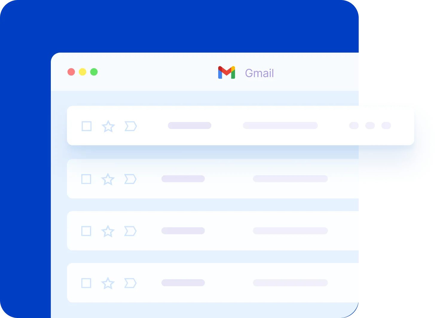
Google Calendar Essentials: Schedule Like a Pro
Are you new to Google Calendar or just need a refresher? From adding and editing events to managing multiple calendars and adjusting notifications, this video covers everything you need to know!
Google Drive for Desktop: A Step-by-Step Tutorial
Want to access your Google Drive files directly from your computer without opening your browser? In this video, I cover everything from installing the app to syncing folders and managing your files efficiently.
