


7 Time-Saving Websites You Should Be Using Right Now!
Create awesome visuals
Do you run your own business or maybe you're an entrepreneur, or perhaps you just like to save time while you are online? Well, then this video is for you because I'm sharing with you seven websites which are going to make you look amazing online
and help you save time. So let's dive in. Now, the first website on our list is Visme. Now Visme is a tool to help you create any design project that you want. And yes, we're talking so much more than just social media, whether it's presentations or documents or maybe even graphics for your own website, Visme has you covered and allows you to edit anything that they provide here with their templates, but perhaps my favorite Visme feature of them all are their branded templates where all you need to do is add your website address and it will pull in your logo and your brand color in just a few minutes.
Let me show you how it works. All I need to do is enter in my website's URL, so yeah, I'll use simplivity.com in this case, I'm going to select Go. And what Visme is going to do is extract as much information including my logo, my brand colors, even the fonts from my website, so that I can start to use that within the Visme editor.
After it's done pulling in a bunch of information, I may need to select which of these images is my logo. So that is my logo there. I'm going to select next. Next you can see it's identified the fonts from my website and it's even identified some of the fonts that it does not yet contain, but no problem. If I want to, I can upload them here as well.
So in this case, I'm going to add these two to my brand kit here, and I'm going to select Next. Next up, it's pulled in some of my colors and yes, that blue is definitely a Simpletivity blue. I'm also going to add that green and this black as well.
And yes, let's add this sort of off white that I use quite frequently. I'm going to hit Next. And then I can choose which type of theme am I most interested in? I really like this creative theme so I'm going to select that as well. Now, the great thing is, is that it's not going to limit me to just one or two templates.
No, it's going to bring back more than 30 different templates that I can use in a variety of ways. Now that the branding wizard is finished I can go through and take a look at some of the templates that it's created.
Here you can see that it's got my logo and my colors and my fonts directly within some of these templates. I like this one here. I've got my logo here at the bottom. I particularly like this infographic here on the right hand side, it's even about boosting productivity.
It's got my brand colors. It's got my logo here at the bottom. And of course, all of this is editable. So I can apply this and start to customize it for my own needs. So if you're looking for a quick and easy way to apply your brand to some amazing designs
Convert any file
be sure to check out Visme. Now, the next website on our list is called CloudConvert,
a free way to convert almost any type of file to any other type of file format. Whether you're talking about documents or images, or audio files, or literally almost anything,
CloudConvert can allow you to do so. First off, what I like is that we can select our file
from a variety of places. It doesn't have to be from our computer. You can actually go and just grab a URL from the web or connect it to one of your cloud services. But in this case, I'm going to grab an image from my computer.
I'm going to grab this logo here. So here in the top right hand corner it shows that it is a PNG file but maybe someone is requesting a WEBP file from me and I don't have any of this software on my computer that will do that for me.
I don't want to go searching for that. Why not just come right here to CloudConvert? So I'm going to select that type here. I can choose this little gear icon if I want to make a few additional adjustments, I'm going to say that everything is okay and then I can select the convert button.
Now, of course, depending on the size of the file and what is being done, it may take a few extra moments but now I have this image in the correct file format. I can download it and I can use it anywhere that I like.
So if you need something that is quick, easy, and allows you to convert up to 25 free files per day be sure to check out cloud convert.
Build websites fast
Now the next website on our list may not exactly be new to you but I've included it here because we often forget how fast and easy it is to create a website with Google Sites. When it comes to website creation, we're often talking about names such as Wix or Squarespace.
However, if you want to produce a website for free and do it quickly and easily, there is perhaps no better choice than Google Sites. Here I am within a template which I've created and I've named it Special Spring Event.
So even if you have zero experience with creating a website, Google Sites makes it super easy for you to do. Everything is drag and drop, or just click in a space, if I want to come up here and rename this event this is my special event right here, I can do so.
And on the right hand side, the ability to add different types of content or change the layout or navigate across my website makes it very easy as well.
I think perhaps one of the best uses of Google Sites is if you are needing to create a landing page or a very simple website, maybe you're hosting a webinar, maybe you have a extra special deal, or an extra special sale, and you don't want to include it in your entire website,you just want to send people to a special registration page, for example, Google Sites is absolutely excellent for those purposes.
And if you're already a Google user, you have the advantage of accessing your Google Drive account or all of your photos directly from within the editor.
So for example, maybe in this day three slot, I'm going to click on this plus button and I'm going to say select an image and it's immediately going to bring me to my Google Drive. I'm going to select this image here and bam, it's directly in my website. Couldn't be easier for me to navigate and find the images
and find that content that I want to include.
Make short links
Now, the next website on our list is going to make sharing your content and sharing other links so much more easier and also more inviting for your viewers.
And we're talking about Bitly. Bitly is the easy way to take a long and complicated and maybe messy looking link and create something so much shorter but also something that is a little more relevant so that your users will click and access that content.
For example, here is a lengthy and somewhat messy looking URL but with Bitly, I was able to condense it to just this. And it actually has some actionable words in it, get jot form app, for example. So let's show you how easy it is to create your own.
In the top right hand corner, all I have to do is select the Create button and here I can paste in any link I want. I don't have to be the owner of that link, it could be absolutely anything on the web. So in this case, I'm pasting in a blog post from my own website,
something that is going to be much too long to include in a social media post. I'm going to hit Enter. And what Bitly is going to do is create a shortened link, here it is, it's bit.ly/ and then we've got about seven characters here behind it.
But the nice thing is that I can go one step further and customize the back half. So in this case, maybe I'm going to call this chromeaddons, let's see if I can use that. Now, Bitly is going to warn me if this Bitly link has been taken.
So for example, this particular custom link has been taken by someone else. So I'm going to say, trychromeaddons, let's try that for a second and see if that one is taken. No, I can use that one. So now it tells me that the link has been edited.
All I need to do is hit this copy button and now I can paste this anywhere that I want and people will be able to go directly to the desired page.
On top of that, Bitly keeps track of your statistics. So if you want to see who has been clicking and where, you can keep track of your history here as well.
Share interactive polls
Now, the next website in our list is not only going to make you look great online but it's going to make your presentations really stand out so that they can be more engaging with your audience.
Here I am at the Mentimeter website and Mentimeter is all about creating content so that people can answer your polls, can answer your questions in real time. So for example, here, I've set up a new type of presentation
and I can choose from a variety of different options whether that's a multiple choice,
whether that's a scale, maybe a word cloud, or any of the options that are listed down below. Let's stay with multiple choice. So we need to start by asking a question,
which is your favorite social media platform, for example. Let's do that as our question. And then we obviously have to fill in our options. I'm going to put in Facebook, I'm going to put in Twitter, and then I'm also going to put in, well, yeah, it wouldn't be my video if I didn't say YouTube.
So I'm going to say Facebook, Twitter, or YouTube. Now there's a variety of other options we can make here, including editing images. And of course changing the colors here on the screen as well.
Now, when you're finished editing your question, or if you just want to see how it's going to look like for the people that you send it to, all you need to come up here is select the preview presentation and whether they access this on their desktop or on their mobile device this is how it's going to look like to them.
So for example, if I select Facebook and select Submit, I'm going to see that in real time and others who go to this particular room, menti.com and then enter in this code will be able to not only participate but see the results as well.
So a very quick and easy way to make your presentations that much more engaging. Of course, if you don't want your participants to remember this address and to type in this particular code, you can also hit the share button and copy the direct link.
This is perhaps the easiest way for people to get into your polling slides, or you can choose to download the QR code so that they go directly to your poll just by scanning with their phones. So a variety of different ways for you to take advantage of Mentimeter.
Write awesome headlines
Now the next website on our list is something that I use on a very regular basis. And it's called Capitalize My Title. How often have you been putting together some content whether that's a blog, podcast, video, or maybe something else for your website, and you're not sure exactly how you should capitalize that phrase or that title depending on all of the various styles.
Well, Capitalize My Title makes it easy for you. Now you can either paste in your title idea right here or just start typing into the field. So I'm going to say how to create amazing designs for your website. And as you can see, it's going to dynamically change some of the capitalization based on what I've entered here.
Now, at the this point, I can select this copy and go and copy it and paste it wherever I like. But the other thing that I like is that Capitalize My Title has its own headline score. Here you can see down in small print I've got a headline score of 70.
So in this case, I can see I've received a readability score of 75 and an SEO score of 51. If I scroll down, you can read all of the details in terms of where you should be aiming and also maybe where I should be improving, in this case, when it comes to maximizing your titles and getting the most eyeballs on your content, it's always great to have a tool such as this on your side.
Easy photo editor
Next up, let's talk quick and easy photo editing. Have you ever wanted to make some touch-ups to your images but you don't want to either pay for or download an expensive photo editing suite? Well, that's precisely where Edit.photo comes into place where you have all of the features that you would expect from a photo editor, but right from within your browser. So in this case, I'm going to say select a photo.
I'm going to go and grab maybe this one right here. And let's say, yeah, I want to crop it maybe a little bit. So I'm going to come down out here and crop it to the way that I like it to be. Maybe I want to put a filter on this image.
I can do so as well, whether you're looking to make some small adjustments, or you want to add some annotation or resize your image, you can do it all right here with Edit.photo. So rather than downloading those images and doing it on your desktop, you can do it right here within your browser with Edit.photo. Now, of course, I'd love to hear from you next.
What are some of the websites that help you look amazing and save time online? Be sure to let me know in the comments down below. And if you enjoyed this video, you might also enjoy these videos as well.
Remember being productive does not need to be difficult. In fact, it's very simple.
Top Project Management Apps: Which is Best for YOU?
Most Spreadsheet-Like
Not sure which Project Management Tool is best for your needs. Well, don't worry. In this video, we're looking at seven popular project management apps taking a look at their unique features, and I'm going to tell you which one is best for you or your team's needs.
Hello, everyone, Scott Friesen here at Simpletivity, helping you to get more done and enjoy less stress. And yes, I'm going to be handing out a couple of awards so you can get that much closer, to finding the perfect project management app just for you.
Now, the very first tool in our list is Smartsheet. And I've decided to start here for a reason. If you're brand new to Project Management Tools and applications, you're probably coming from a spreadsheet environment such as Microsoft Excel or Google sheets. And Smartsheet, of all of the apps on today's list,
is the most spreadsheet-like. Now that's not a bad thing. If you're already comfortable working within a spreadsheet you're going to be very comfortable transitioning and moving your project management over here to Smartsheet.
But don't get me wrong, it's so much more than just a spreadsheet. Here on the left-hand side, you can see I can add notifications, comments, attachments,
and other attributes to any line item here. So rather than just filling in the text,
I can have a document attached directly to this line item. It also makes it very easy for me to make assignments to either myself, or other members of my team. But if you like seeing these start and end date and seeing other columns listed in a spreadsheet type view, Smartsheet may be the one for you.
Most Customizable
Next on our list, let's take a look at Asana. One of the most popular Project Management Tools over the past decade. Now here you can see, we're getting away from that spreadsheet look, and Asana has a fairly straightforward interface here.
In this particular example, I've got three different sections or three different stages for my project. But what's great about Asana, is that not only can you dive deep and actually see the components of any particular task, but you can still see what's going on here on the left-hand side of your project as well.
As we continue throughout today's video, you'll notice that often we have to either dive deep, or look at the project view. And Asana is one of the better components when it comes to viewing both at the exact same time.
Now, one area where I give Asana some particularly high marks, is when it comes to customization. Here in the top right hand corner I can click on this customized button, and easily add my own custom fields but also turn on or off other fields that I may not need.
Asana is also especially helpful if I want to create some customized rules. So for particular behaviors or particular assignments
when it comes to my projects. Now, Asana is certainly not the only one that provides customization, but I'm going to give it the label of most customizable. So whether your team is big or small, Asana has you covered with a variety of customizable options.
Most User Friendly
Now the next project management app on our list is Hive. And one of the things I love about Hive, is how user-friendly it is. It's really quick to get going and set up, but also has added some nice touches that you may not find elsewhere.
Number 1, when you open up a task I like how Hive has naturally created some separation. So we got some key things here such as assignee, date, status, and priority level, separate from the details of the task itself.
Often, this is where we want to go or the information that we need to see, but sometimes it can be buried in with the rest of our information,
as you will see in other applications. But I also like how Hive has included some additional features that really make things that much more handy. So for example, here, if I want to assign this task to myself, it's going to ask me if it also wants to assign all of the sub actions. What it refers to as subtasks here, within that task.
So I'm going to say, "Yes, update the subactions." And now you've can see, I'm also added to these as well. In most other project management applications, you'll have to come in here separately and add yourself to these subtasks.
So it's these little things that can go a long way. I also particularly like that Hive has some built in notes,
and not only can you take notes right from within Hive, but you can then convert them to actions or add them to existing actions. So for example, if I need to send this email reminder I can hit this plus button, and either create a new action which is essentially a task within Hive, or I can add it to an existing action and say that, "Yes, this is related to the product roadmap, "insert that as a subaction." So, some great features here.
Now, one of the reasons that Hive is so user-friendly, is because they actually listen to their users. Here in the top right-hand corner, I'm going to click on the feature request option. And here you can see, they welcome your feature requests in a very simple feature request form.
Now I don't have to fill in 7 different fields, and give the name of my firstborn child. But you also get to see all of the other feature requests as well, what people are saying, and how many votes they are getting.
For example, if I sort the feature requests from the top, you can see that the three most vote getting features are all in progress. Yes, Hive is actually building out
these features as we speak. And if I click on this first one here, you can see that this feature was requested on January 21st and then less than two weeks later, they were starting to build it out.
So if you want to use a tool where you know your voice will be heard, Hive may be the best solution for you. Now you can start using Hive right away
on their free forever version. But if you need more, be sure to use the discount code SIMPLE10, to receive 10% off your subscription.
Most Affordable
Now the next app on our list has gained a lot of attention and a very loyal fan base. And that is ClickUp. ClickUp, gives us a nice mix of being able to access certain things
and certain pieces of information, on the front or the project level, but also being able to dive in and give us lots of space to use this information. Whether we're adding subtasks and dependencies, or editing things here within our project.
I especially like that they give us so much room for the description field, and have even added a nice touch. If I want to minimize this information on the right-hand side, I can make this larger as well.
So, depending on your needs or the comfort level of your team, this might be a great solution for you. I also like that you don't have to stay in this high level project view, but we can drill down to different areas or phases of that project.
So, maybe I just want to focus on Phase 2 today, I don't need to see everything else in relation. If you are new to Project Management or perhaps your team is, this could be a great big barrier.
If they always have to come back and see so much information at once. ClickUp makes it very very easy for us to drill down, and just see the info that we're looking for.
But in terms of its greatest strength, I'm going to give click up the label of "Most affordable." Yes, it has a free forever version, which many of the tools do on this list.
But if you need more, their first pricing structure starts at just $5 per month. Most other Project Management Tools start at $10 a month. So you can gradually work your way up depending on your needs.
Most Powerful
Next up on our list, we are taking a look at Wrike. W-R-I-K-E. And at first glance, you may be saying that we're returning to more of a Spreadsheet-like view. But I would say that Wrike is a better balance between a spreadsheet view where we can make changes and edit things here on the fly, but also be able to dive into any of these details.
So, if we need to keep, for example, a checklist, or dependencies or other things hidden within that task, we can do so while still seeing that high level view here. And if you don't like the table view, don't worry, Wrike also has a list view, and a Gantt Chart view, so you can see the information the way that you want.
But another great feature of Wrike, is being able to have quick access to certain dashboards or snapshots of the way you want to view your data.
Here, under the tool section, I can set up a campaign calendar, I can set up a number of different dashboards for me to look at, I can also set up certain contracts or certain files.
So I can just zero in on what I want to look at. While you can achieve many of these views in some of the other tools in which we've looked at already, I think that Wrike makes it the easiest for us to access and get into these pieces of information.
When it comes to the label that I'm going to give to Wrike, I'm really going to say the "Most powerful." It's hard to just scratch the surface when it comes to Wrike in terms of what it can do,
and what it can also integrate outside of just the platform itself. This may be too complex or maybe too enterprise looking for some of you, but if you are needing a powerful Project Management Tool, Wrike can certainly meet your challenges.
Most Intuitive
Now, if Wrike is possibly the most complex and the hardest learning curve on this list,
Trello would find itself on the other side of the spectrum. In fact, most people can get started with Trello in just a number of minutes. Trello was really the first application
to bring to prominence this idea of a board-style view. Now almost every other Project Management Tool including the ones that we've looked at today, provide a board-style view or at least something very similar.
But Trello keeps things very, very basic. So you can get started in just a few moments. It's also very easy for team members who are needing to learn a new tool, in a short amount of time.
So for today's list, I'm going to give Trello the award or the label of "Most intuitive." It's going to be your quickest route to setting up a project, and manage the things that you need.
Now, while Trello does include some powerful automation and customization tools, Trello's real strength remains in its simplicity. So that you can focus more on the work, and the tasks and getting things done, rather than managing the system itself.
Most Versatile
Now, the last project management app on our list is monday.com. Certainly the most colorful tool that we've looked at so far. And in many ways, it's these visual indicators
which many Monday users love the most. Not a only can you manage your tasks in a variety of different stages or different workflows, but you can see at a glance how long something is coming along. Even this row called "Asset files," where it's actually showing me a small preview of that image can be very helpful rather than having to dive into each and every file.
And if I scan over here to the right, you can include as many different columns or as many different details as you need. So you can really customize your look and feel of monday.com. In addition to a large variety of project management features, you can create your own documents right here within the monday.com space. Or maybe you want a dashboard that you want to share with others.
A lot of customization, a lot of versatility right here within the monday.com space. In addition, Monday has one of largest libraries of integration. So whether you want to integrate directly with your CRM system, with an email client, an email manager or some other tool, chances are Monday has the plugin to allow you to do so.
Now is there a Project Management Tool that I didn't include on this list, but you would like to learn more about? Be sure to let me know in the comments down below.
And if you enjoyed this video, you might also like the other content right here on the Simpletivity channel.
Remember, being productive does not need to be difficult.
In fact, it's very simple.
My Complete Productivity System + How Much I Pay for Each App
Note-taking app
Recently, I asked you what video you wanted to see next here on the Simpletivity channel. And the suggestion that received the most votes was this one. I want to see your productivity system.
How you take notes, manage your tasks, calendars, projects, and how you use apps and devices for this. Well, you want it? You got it. In today's video, I'm going to share with you my five core productivity tools, how I use them and also what I'm paying for them on a monthly basis.
So let's dive in. Now for privacy reasons I'm not going to be sharing with you my actual tasks or my actual calendar and information. I of course have things that I do not wish to share or others do not want to share publicly with the rest of the world but I am going to show you each and every tool, how I use them and tell you specifically which version I'm using in case you want to know the features and functions available.
So let's get things started off with of notes. Now when it comes to note taking, I actually use a combination of digital and analog. I always start my day with a fresh single piece of paper off to the side of my desk.
I honestly find this the quickest and easiest way to jot down those little distractions and things that come up as a part of the day. It also allows me to quickly review those things as a part of the day and especially at the end of my workday. But when it comes to digital notes, my tool of choice is Google Keep. Now, there's two reasons for this. Number one, I feel that Google Keep is one of the fastest note taking apps out there.
When it comes to loading, searching, finding, or taking new notes, I find Google Keep can almost not be beat. Now there's a couple of reasons for this, Keep does not have nearly as many features or functionality as some of its competitors but when it comes to my note taking needs, if I want to quickly grab a new note or an idea
I can do it so quickly and easily and get back to the rest of my day. Now Keep allows me to arrange my notes in a variety of different ways. Whether I want to add labels,
pin specific notes, maybe add some color shading or adding checklists to specific notes. So there's enough versatility and variety for all of my note taking needs. And of course, a bonus of using Google Keep is that it is absolutely free.
Now know I'm not going to get into a debate in terms of what I am giving up for using this technology
and that Google does have access to some of my data. For the context of today's video, when I say free, I mean I am not paying anything from a credit card or from my bank. So let's move on to tasks.
To-do list app
Now, when it comes to managing my tasks, my core app is actually my calendar.
Longtime subscribers to the Simpletivity channel will know that I've made several videos on how to manage all of your core tasks right here from within your calendar.
Now for me, that's Google but you can do this exact same process within Microsoft Outlook or really any other digital calendar. In fact, I don't know of a calendar that does not display it's all day events at the top of each day.
And that's exactly where I store and where I manage my key tasks for the week and for the day. Now that's not the only place where I manage tasks. I also use a combination of time blocking and time boxing so I can manage tasks as a part of my calendar.
The main reason for this, is well, I never ignore my calendar. I'm always in here and you're probably always within your calendar as well checking on that next meeting, or what's coming up as a part of your day or later in the week. And the great thing about adding your task here
as an all day event. Let me just add one super quick here, is that you can't ignore them. It doesn't matter if I scroll up or down, it doesn't matter if I go to the debut here,
that all day event area is always going to be displayed at the top of the screen. Now, when it comes to cost, you can certainly use Google Calendar for free. However, I am a Google workspace subscriber and I'm currently on the business starter plan.
So I pay $6 a month. Now that subscription covers a variety of tools including Gmail, Google Drive, and several others but I've decided to include it here because technically my calendar is a part of that workspace account.
Project management app
Now, when it comes to my project management tool of choice, I am using Trello. Now Trello, I use very specifically because I manage my day to day tasks within my calendar, I use Trello for two specific types of projects.
Number one, if there's a recurring process which is going to happen again and again and again. While I'm not showing you my actual Simpletivity YouTube process board, this is where I manage all of my video content.
Everything from creating and coming up with ideas, all the way to recording, editing, uploading and scheduling it for release. So this is a recurring process that I'm involved with on a weekly basis. But then on top of that,
I may have some other larger projects. So for example, three times a year I offer the reset productivity masterclass. I create a new board or a new project here within Trello, so I can manage all of these steps, all of the things that I need to complete specific for that project.
So if the task is really not related to a larger or a bigger project, it's going to be placed on my calendar but for larger or recurring work,
I'm going to manage that right here within Trello. Now Trello continues to offer a free version. However, for my needs since I do need more than 10 boards to manage all of my projects and I also make use of some of the more advanced features within Trello
I am paying $10 a month for their premium version.
Scheduling app
Now another tool which has increasingly played a bigger part in my daily productivity is Calendly. Now you're probably already familiar with how Calendly works. You can send out a single link and then people can have access to your availability.
This can really cut down on all of that back and forth as you try to find the right time to meet with other people who don't have access to your personal or your business calendar.
However, Calendly can be used in so many other ways which is not only time saving for myself, but has also become revenue generating. One of the key reasons why I subscribe to the professional version of Calendly is because I can take payments as a coach or a consultant. If you want people to book time with you
and to be able to pay your fee up front, Calendly is an excellent solution.
If I come up here and click on the integrations tab, you can see all of the other apps
in which Calendly integrates with directly, but in particular it integrates with several payment processors including Stripe and PayPal. So if you're wanting people to book time with you and to pay for your services in advance, Calendly can be an excellent solution. I'm currently subscribed to the professional package which is $12 per month.
Email extension app
Now the last tool I'm going to share with you as a part of my productivity system also happens to be the most expensive. And that might be surprising because it's not even a standalone app. In fact, it's an extension. It's an add on for Gmail.
And what I'm talking about is Boomerang for Gmail. Now you may have heard me speak of boomerang for Gmail in the past. And yes Boomerang does offer solutions for Outlook users as well.
At first glance, you may think that Boomerang is not really much of a productivity tool. It doesn't fit into the category of project management
or task management or necessarily scheduling. However, it has saved me not only so much time but has allowed me to avoid tracking follow up in my calendar or in a task manager or in a project management system that I really do feel it's a core part of my productivity system.
Down at the bottom of any Gmail message, you will see the boomerang features displayed once you have the extension installed. And this remind me function, is something that I use constantly. Probably at least a dozen times a day.
So in this example, I'm following up with someone. We've had a meeting and I just want to see if they've had a chance to view my proposal. Now I could send this email and then give it a specific label or a flag or maybe copy it to my calendar
and remind myself to check in two days from now. That's an awful lot of work. And what if Jane replies to me immediately then I've got something I got to go back to
and remove or delete. Well, with Boomerang I simply need to check this box and determine the timeframe as to when I want to be reminded in the future. And best of all, it's only going to remind me if this person does not respond to my email.
If Jane happens to reply to me within two days, I'm not going to be reminded or receive a notification. This has become such a core part of the way that I deal with email
and don't have to track these follow ups and other things in other tools that it's really become a core part of my productivity system. Now, as I mentioned
I am using the paid version of Boomerang. I'm paying $15 a month for the pro version.
Boomerang does offer a free version, but you are limited to the number of times in which you can use this feature and some of the other functionality. However, they also have a cheaper version if you don't need everything associated
Total monthly cost
with the pro version. So if we review my total cost for these five apps, I'm paying $43 a month. That's less than $50 a month for tools that I find are essential for the way that I work, help me to get more done and to enjoy less stress.
Now that you have deeper insight into my productivity suite, I'd love to hear from you. What surprised you about today's video or what questions do you have and what would you include in your top five productivity tools? Be sure to let me know and share others in the comments down below.
If you enjoyed this video, be sure to give it a thumbs up and perhaps you'd be interested in one of the videos on the screen now.
Remember being productive does not need to be difficult. In fact, it's very simple.
How to Send Digital Signatures without Paying for DocuSign
DocuSign pricing explained
Having the ability to send out agreements and manage e-signatures has become essential in today's business world. And near the top of that list is DocuSign, perhaps the best known website and application for e-signatures.
However, depending on the size of your team and your needs, DocuSign can get quite pricey. Let's take a quick look at their pricing page. Now their personal plan starts at just $10 a month, which sounds quite reasonable. However, that limits you to just five documents a month.
So in most cases, if you're sending out more than five a month, you're going to have to upgrade to the standard edition, which starts at $25 per month. And yes, that is per user. And with all of the other subscriptions that you probably are engaged with,
that can add up really fast. Well, this is precisely where a tool like DigiSigner comes into play, offering you the same features and security of DocuSign, but at a fraction of the cost. So yes, you can get started with DigiSigner with their free plan.
Now it's true that's only going to limit you to three documents per month, but perhaps you're only sending out a small number of agreements. If you need to upgrade to Pro, it starts at just $12 per month. Yes, that's less than half the cost of DocuSign standard package.
And if you need to add more members to your team, you can subscribe for just $40 a month which includes up to five senders. In contrast, just two standard members here within DocuSign, will cost you more than up to five senders here within the team plan. So enough about pricing.
Let's dive into DigiSigner and show you some of the features and functionality.
DigiSigner document dashboard
So here I am within my DigiSigner account. And first off, I love the simplicity. DigiSigner is not trying to lure me in with a variety of different options or folders or links that are probably not necessary, because when it comes to documents and agreements, I want to come in here, I want to upload, I want to send it, I want to see what is waiting either for me to sign, or I'm waiting for others to sign, and then get on with my day.
I'm not running my entire business here within a document signing application, but it's important to secure those agreements and to secure those contracts. So everything is very easy and well laid out. Now let's get started by uploading a document, and you can upload almost anything.
It doesn't have to be a PDF. In this case, I'm going to come down here to a sample contract form and I'm going to upload this particular document. So here it is at the top. Now I haven't sent it out just yet.
Again, DigiSigner keeps it simple. We either can sign it ourselves, send it for signing, or we can have other more options which I think is great to be tucked away. More on this create link a little later, a feature which you will pay a bundle for within DocuSign.
Creating digital signing agreements
So after uploading your document, the first thing you're going to want to do is specify where you are going to want others to either fill in information or where to sign their name. So in this document I've got a few different fields that I'm going to want to specify.
And the great thing is, is of course I can create a template out of this. So I only have to do this once and then repurpose it in the future. So at the beginning of this document we've got a date field. So I'm going to come over here and select that date field so it's very easy to input there.
And then I've got some client information.
So probably yeah, a text field is going to make the most sense. Now you'll notice when I click on any of these fields, I have some other options available to me here on the right. So instead of just saying text, I could actually help them along and say client name, for example, then that will appear directly within this field.
Let's stick with a text field. We're going to put that down here for address and then we'll do for phone as well. And of course everything is essentially drag and drop. So if we want to line that up, we can do so. But let's go down to the signature part itself.
So here, I'm going to add a signature field and everything can be customized to the space or the document that you have filled in here. I want them to next input their name. So let's do that down below.
And maybe I'll give them a little more space here in this field here so it matches up with the signature line. The date field, in this case I'm going to choose the date sign, because why have them fill it in, when we just want to take whatever date it is when they actually sign this document?
Make it easier for them and also ourselves and last but not least, I'm going to put in one other text field here,
let's reduce the size of this just a little bit like that, perfect. All I need to do at this stage is select done, and now this document is saved and it's ready to be sent.
How to send and manage digital agreements
So in this step, I'm going to say, send for signing. So here, some of the nice features within DigiSigner is that just like in DocuSign we can set a signing order. So all of those more advanced features that you may be used to in other tools, you can do right here as well.
So if I'm going to be sending this out to multiple signers, I can say in what order it needs to take place. So after filling in an email address, let's fill in this email address here. I can check some of the other things including what the message will look like down below.
I'm going to say, send the document. And immediately I have a status of that document down below. I can see it's been sent to this email address, but it hasn't yet been opened. In this agreement down below, you can see number one, it has been signed by this individual here.
And just for my example, I used the same email address. It was also viewed, so I can see the status
of when someone has viewed it or not. The great thing is, is I don't have to dive into
any special folder or any special waiting area. In fact, if I want to resend the document or just remove the signer, I can do that all here as well. So the layout, the simplicity of it allows me to be more productive and efficient,
How DigiSigner looks to your recipients
so I can get on with my day. Now, when it comes to those who are receiving your documents, the experience is simple and straightforward. So here I've received a notification that someone has sent me the document.
I'm going to select open the document, which will pop it open in a new tab. And if you've signed anything in the last few years, you will notice what this experience looks like. I can add my own branding so here we can see they can be confident that it is coming from me.
I'm going to agree to use these electronic records and signatures which makes this signature binding in this case. So now you can see I've got all these fields here waiting for me.
I'm not going to fill them all out, I'm just going to jump down to this signature one here. And I'm going to say, yes, that's my signature. Or I could draw it, or I could upload a signature. In this case, I'm going to use one of the pre-filled ones.
It's going to remind me that, hey, you haven't actually come up here and signed or filled in the client space, so I can hit next as it will walk me through the different sections.
Give me a gentle reminder as to where I am in this document. And if we jump back into our DigiSigner account, I can now see that that document has been viewed. I can keep tabs on this just in case I don't receive that signature within a desired timeframe.
Create links to recurring electronic agreements
Now, another great feature within DigiSigner is the ability to create a link for any of your most used documents. So let's say for example, you're offering an agreement on your website, or maybe it's something that you just send out so frequently, you don't need to pre-fill it with their name or their information. Would it be easier just to get them to click on a particular link.
So in order to create a link, all you need to do is select the more dropdown and then select create a link. Now, the first thing it's going to do is create a template. Now, here you can see I've got the URL.
So this is the link that I can either embed in my website, I can add within an email, or wherever I would like them to access it. And I can set if you prerequisite, such as what I want them or need them to do before signing or after signing. In this case, I'm just going to keep it
nice and simple and hit save. Now I can jump down to the template section of my account and here I have that agreement waiting for me. I can click on the more button and say show link and copy this and send it to whomever I like, saving me time, but also saving many of my users' or my potential customer's time, if I want to give them access to an open document allowing them to sign it and fill in their information and then send it at their leisure.
And of course, all documents signed with DigiSigner are legally binding and they comply with all major e-signature laws including e-sign UETA and the European Union.
So if you'd like a simple and professional way to manage all of your e-signatures and do it at a fraction of the cost, be sure to check out DigiSigner. See the link in the description for further details.
Now, if you enjoyed this video, you might also enjoy the videos which are being recommended to you on the screen now.
Remember, being productive does not need to be difficult, in fact, it's very simple.
7 Google Sheets Tips Every User Should Know!
Adding dropdown menu or checkbox
Are you ready to save time and learn some cool new productivity tips for Google Sheets? Well, then this video is for you because I'm sharing with you seven different tips, so you can get the most out of your sheets.
Hello everyone, Scott Friesen here at Simpletivity, helping you to get more done and enjoy less stress. And let's dive in into tip number one. So, in many cases, we want to keep track of what is happening
with our data within our sheet. And for that purpose, it may be helpful to add either a dropdown or a checkbox. Well, it's actually a lot easier to implement than you might think. So, in this example here, I've got a a final column called Shipped and I want to keep track if something has been shipped or not.
So, all I need to do is select the range or select the cells where I would like that dropdown to be. I'm going to come up here to Data and then select Data validation. Now, the second dropdown here,
which currently says List from a range, I actually want to come down and select List of items. So here, in the field next to it, is where I'm going to put what I want within that dropdown.
Yes, you don't have to create that list somewhere else in the spreadsheet, you can do it right here. so I'm going to say, Yes, comma. I'm going to say No and then comma, maybe I'm going to put something like Delayed or something along those lines. So, you can add as many different options as you want.
We're going to leave this checked: Show dropdown list in cell, and I'm going to hit Save. Now, you can see we've got a little dropdown arrow beside each and every one of these rows. So, I can go down and say, "Yes, that was shipped," "No, that was not shipped," and, "We're still waiting for this.
That has been delayed." Adding a dropdown to your sheet will not only make it easier for you to make certain selections, but also prevents the chance of you misspelling something or having to type in the same thing over and over again.
But in some cases, all you need is simple checkbox
and we can add that quite simply as well. Once again, we're going to select the range of cells where we want that checkbox to appear and we're going to go back to Data and then Data validation.
Now this time, from the dropdown, we're going to come all the way down and select Checkbox and then hit Save. And now, we've got a simple checkbox waiting for us. So we can check things off, maybe in this case, meaning that they have been shipped and I can check and uncheck as I go along.
You can also apply conditional formatting to both of these options, which may just spruce up and make things pop that much more within your Google Sheets.
Apply alternating colors
Now, speaking of making things stand out, sometimes it can be hard to analyze a large group of data or a large number of rows and columns. It's really hard to distinguish the differences here and maybe if I want to point out or see a particular number.
Well, it's very easy for us to apply some alternating color. And you've probably seen this many, many times over in other reports or things you've seen in magazines or other places online. All we need to do is select the area where we want to apply this.
We're going to come up to Format and then we're going to come down here and select Alternating colors. Now, immediately, it's going to apply something here. It's kind of a grayish color here where we've got a deeper gray at the top for our header.
And then it's sort of alternating between light and dark, but we can also customize that color. So maybe I want something that's a little brighter, maybe with this orangey color here. Maybe I want something a little more bluish, which is in line with my own branding.
And now, it's that much easier to see the different figures here within our sheet. And, of course, if you don't like any of the default styles here, you can come down here to Custom styles and choose your header, color 1, or color 2 to suit your needs.
Sum up new rows
Now the next tip on our list has all to do with a formula that we all use on a frequent basis. And that has to do with summing up a particular set of figures. So let's say I want to sum all of the total cost here.
I'm going to go to this cell over here and I'm going to type in sum and then all I need to do is just select this area here. Pretty straightforward, right? I can hit Enter on my keyboard and there is the total sum.
But what if I start adding other items here? Let me add in, I don't know, maybe $250
and then $350. Oh, wait a minute. It's not adding things up because I selected just this range. So, anything below is not going to be added here. Well, if we come back to this formula all we need to do is come over here and remove the 20.
Remove the 20 from the row here and then hit Enter. And what it will do, it will continue to sum up everything within this particular column. It's essentially ignoring the row number over here and will continue to add things up.
So not only is it giving me the current value here, but if I add something like $500, yes, that's been added. Let's add $1,000, you see it will continue to add things up. So the next time you need to use these Sum formula, see if you need to put a specific end to your range or just to leave it blank.
Dynamic currency exchange
Now, this next tip is especially helpful if you are dealing with multiple currencies or currency exchange. So in this example, I have a total, which is listed in US dollars.
But maybe I want to see the value of these dollar figures in Canadian dollars. Well, what we can do is rely on the power of Google Finance to give us an accurate exchange rate right here within our spreadsheet.
So in this case, I'm going to start with this cell. I'm going to type in the equals sign. And, of course, I'm going to reference the cell that I want to convert. Next, I'm going to hit the asterisk, which, of course, means multiply, and then I'm going to start typing in Google Finance. Now, I don't even have to type in the entire thing. You can see it's giving me that suggestion.
So I'm going to hit Enter to complete that so Google Finance is in the formula. Next, we want to hit our open quotes and then type in the word currency. All right, currency and then colon and then in this case, I'm going to type in USDCAD.
Meaning, I want to convert from US dollars into Canadian dollars. If you're not aware of the currency code, you may need to look that up in advance. We are going to close quotes, and then close the bracket, and then hit Enter.
And now, we have an actual up-to-date currency exchange for this amount. If I want the entire row, all I need to do is drag this down. And now you can see, I've got an accurate currency conversion
of these US dollar figures on the left. So a great formula to know, especially if you want to have those multiple exchange rates live on your sheets.
Sparkline mini graph
Now, the next tip on our list is one of my favorites and such a great way to see some visual data without having to create a complete chart. You're probably familiar with the ability to create a chart, whether that's a pie chart, or a bar chart, or something else that may take up much of a particular tab.
But what if you just want to see a quick visual of a particular set of data? So in this case, maybe I want to see how our sales of units are trending over time and I just want to include that down here below.
Well, all I need to do is click on any cell, hit the equals sign, and then type in the word sparkline, and we are going to have a miniature chart. So sparkline, and then within the brackets, we just need to select the range that we want to view and then hit Enter.
And now, we've got a great visual of what is happening just within that particular set of numbers. So I can see that we started off quite strong, and then dipped, and we've sort of been going up and down with the sale of our units.
This miniature sparkline report can be a great way to see how things are trending without taking away and taking up valuable real estate from the rest of your sheet.
Pick date from a calendar pop-up
Next up, let's take a look at how we can make it easier to input dates within any particular cell. So you may already know if there is a valid date anywhere within your sheet. You can double-click on it and it will bring up a Calendar view.
So this can be really easy. If I want to change this date over here, I can just select it by double-clicking. But what if this entire column is a ship date and I want to just double-click in this row? Well, I can't do that. It's waiting for me to input a value.
So in order to add a clickable calendar for every single cell within this column,
first, I'm going to select the entire column or you can just select a specific range.
I'm going to come back up here to Data and select Data validation. Now, we've been here before, but in this case, what I'm going to do is I'm going to select this dropdown
and I'm going to select a date. Once we select Save, we can return to our sheet.
And now, anywhere where I double-click within this range, you can see it's going to bring up that calendar. No, there's no identification letting me know that this is a date field. But wherever I click, I can pull up that calendar, select a date, and then get on with what I'm doing.
You may need to adjust your date formatting to make sure that everything is in line, but this can be a much quicker way for you to select the date that you're looking for and then get on with the rest of your sheet.
View column stats
Now, this next tip is something that I have ignored for years, thinking that it was maybe too simple and wasn't actually helping me out enough. But since I've found it,
I've started using it a lot more frequently. Sometimes, when you have an awful lot of data here, it can be hard to decipher what you are looking for and rather than trying to come up with the right formula. So, for example, maybe I want to see, "Well, how many pencils are actually in this list? I don't want to come up with the formula.
I don't want to have to sort everything here. Isn't there a simpler way?" Well, all I need to do is select the range that I want to analyze, come up here to Data and then select Column stats. And then on the right-hand side, what it's going to do is show me a variety of different data.
So in this case, let's come over to our item and I can see immediately, "Oh, pencil, there are nine pencils, there are eight binders, but I've only sold three pens." And I can actually see that frequency down here below.
In fact, as I hover over these different sets, they will also highlight as well. So if I need to find out where is that desk in this set of data, I can just highlight it here as well. Maybe if I want to jump over to my representatives here, I can see that it looks like Jones is my most successful rep, but maybe Howard needs a little more help.
And again, I can have this option to filter through and highlight that information as well. So, column stats, a great quick and easy way to find what you are looking for. Now, I am absolutely sure
that there are some Google Sheets tips that you find helpful but I didn't include on this list. Well, if you'd like to share that with others, be sure to let us know in the comments down below. Now, if you enjoyed this video, you might also enjoy some of my other tips and tricks listed here.
Remember, being productive does not need to be difficult. In fact, it's very simple.
How to Create Amazing Looking Courses in PowerPoint
How iSpring works with PowerPoint
Do you want to create your own online course, or perhaps you're already very knowledgeable about online training and you're just looking for a more efficient way
to produce those courses? Well, in this video, I'm going to show you how to create a professional course within the comforts of PowerPoint, that's right. You don't have to learn an entirely new software suite, you can create things from your own PowerPoint presentations and produce them online.
Hello everyone, Scott Friesen in here at Simpletivity, helping you to get more done and enjoy less stress. And when I say professional looking courses, I mean it. I mean online training that comes with all of the bells and whistles.
We're not to talking about minor enhancements to PowerPoint,
we're talking about interactive lessons where people can take quizzes, you can upload your own additional content, and manage everything online. So let's dive in and take a closer look. Here I am working on a template as I look to produce an online course.
And you'll notice that I'm right within PowerPoint. You'll recognize the ribbon and some of the features on the top. But at the very end, you'll notice I have one additional ribbon. This is the iSpring Suite ribbon and this is going to allow me to add all of these components to any of the slides that I want.
Either, I can start from scratch, I can start from an iSpring template, or I can convert one of my existing PowerPoint slides something that I'm very familiar with and I imagine you probably are as well. So let's take a bit of a closer look at some of the features that are available to us.
Using the iSpring template library
Right off the bat, you may want to get started with some slide templates. So if we a open up this dialogue here, we're going to be presented with a number of different templates to choose from. Now, you can either view these by the different themes.
So for example, if I like the look of this sort of Olivia theme, I can expand and take a closer look at some of the templates, some of the different slides that they have available here, or I can go over here to the left-hand side of the menu and say, you know what, I'm just looking for navigation right now.
So just show me the different navigation templates that you have available. But selecting the right template,
is just the tip of the iceberg. Remember, everything within here including the text
and the images, is just a PowerPoint holder. So if you're comfortable with editing text,
moving and replacing images, just like I did here on my course objective slide, well, then you can create your course here within iSpring as well.
Adding interactions to your PowerPoint course
But let's get into some of the more interactive components. Here in the ribbon,
you can see that we have a number of different things that we can add to enhance our slides. So by opening up the interaction menu, I can select new interaction and then browse all of the different things that we can add. And this is really going to make your courses pop. So for example, whether you want to highlight a timeline,
maybe you want to label specific things on a graphic or identify a hotspot or maybe create a pyramid showing the different levels or the different structure of what you're trying to show.
So for example, just a few moments ago, I created this interaction pyramid here so that people can click on these different areas and something else will highlight. And as you go, you always have access to the preview button.
This ability to preview your course gives you the comfort of knowing how things are going to look and feel for your students. So for example, if I come down here and select on this interaction which I created, you can see as I click on different areas of the pyramid, the text that I input earlier is going to be highlighted on the left-hand side.
And maybe after going through this preview, I can say to myself, you know what,
maybe I want to change the color of this listen quadrant here. So it stands out a bit more from guide, or maybe I want to increase the text size for example, on any of these areas. This is a fantastic way to see how things are going on.
Adding quizzes and surveys to your course
Now, no online course is going to be complete without the ability to add a quiz or a survey. And what I love about iSpring, is the variety of different types of quizzes that we can add, here within the quiz maker, I'm going to select on the question type
in the top left-hand corner. And you see we can go so much further than just multiple choice or true and false. In fact, I'm amazed at how many course creators, how many course software only allow a limited number of questions.
Here you can see we can do everything from Drag and Drop to a Likert Scale, from a Select from Lists, even in a Hotspot. In fact, that's what I'm creating right here. I've uploaded this particular image. And maybe I want to quiz my course participants as to the ability to identify these different icons.
So up here, I'm going to say, please select the play icon from the image below, for example. Now what I need to do is come over here and select the hotspot shape. So I'm going to select a square in this case. All I need to do is drag it over the correct area, just like that.
And so now when the course participant is presented with this question, all they need to do is hover over and click this area to choose the correct answer. And you can even customize the responses, you can add logic branching, and add specific scoring as well.
So here I am again within the course preview. And let's say I'm going to select this icon and then hit submit. Immediately I get the response and I can customize as to what this has shown to the participant.
Let's replay this once again. I'm going to go back to that same slide, and this time I'm going to select the correct answer. I love just even how interactive this is.
We can even see this sort of ripple effect around where I've selected and I can hit submit. Yeah, this time I got it correct. I can even view my results immediately afterwards. So all of this type of functionality customizable, and I can do it right here within PowerPoint.
And here's an example of another question type that you won't often find in other course makers. So in this case, I've got multiple dropdown menus
and I've asked people to select the correct answer. So when a customer says the price is too high, you should tell them to get lost. Is that the right answer, and give them a discount coupon. How about that, let's hit submit.
Oh, one was incorrect, but the other one was correct. And just like I'm hovering over this task, it can tell me what is the correct answer.
iSpring content & character library
Now, when it comes to creating online courses, it can often be challenging coming up with enough content, enough compelling characters, or objects to include in your slides. Well, here within iSpring you have access to a complete content library.
So for example, I'm going to select this character's option here. This can really help bring your courses to life as you include pictures or example people as a part of your content. Now iSpring makes it super easy for us to filter through all of these options.
Yes, I could use the search bar here at the top and type in some specific characteristics. Otherwise, I can choose what type of clothing they're wearing, maybe I want them to be looking straight at the camera and I want them to be laughing in this case.
And immediately, I'm brought back with all of those many options. So, kind of like the way that this guy looks. I'm going to put Kevin to directly into my slide.
And the great thing is, because you'll have the exact same actor in a variety of different poses, this is a great way to use them as a profile, right? As you go through different situations. Whether that's manager and employee, or customer and sales associate, you can really get a feel of this character as you include them into your content.
Recording audio & narration for your course
Another feature which is essential for any online course, is the ability to record your own audio or narration. This is especially helpful for those of us who may not want to record ourselves on camera.
Now don't worry, iSpring allows you to record and input your own video, but sometimes recording audio is that much easier and you can overlay it or input it on any one of your slides. So after selecting record audio,
we're presented with a full screen view of that particular slide and now we have our recording dialogue. And everything is super easy to use
even if you don't have much experience when it comes to recording on your machine. So here, all I need to do is select the start record button. Hello everyone, and welcome to this course. Here are the key objectives that we'll be learning
in the following module. And now that audio is going to be attached and synced to this slide, all I need to do is select okay at this stage and I'm brought back to my PowerPoint presentation. So quick and easy, I can add it anywhere that I like
Multiple publishing options for your course
and record professional audio. Now, once you're finished editing all of your slides
and your course material, iSpring gives us a variety of different ways to publish that course. If we click here on the publish icon, we're presented with a new dialogue window which gives us a variety of different ways and places to which we can publish our course. Now by default, the My computer tab is going to be selected.
We can either publish this as an HTML 5 Course, so all of the interactive components are intact, or we can choose to produce a video course. If you want your participants to watch a video version of your course, the next two options are iSpring Space.
This is your place to publish things right on the iSpring website, or you can use iSpring Learn which is a full learning management system. Now, if you're already creating courses professionally, you may have your own LMS system either for your organization, or for the company that you are working for.
And don't worry, iSpring is completely SCORM compliant. If don't know what that means, that's okay. You probably don't need to know what that means. But SCORM gives you so many other possibilities and is usually mandatory for any LMS.
Last but not least, you can also upload directly to your YouTube account if you want to use iSpring for creating engaging education and training material online. Now, if you'd like to learn more about iSpring Suite and try it free for 30 days without a credit card, be sure to click the link in the description down below.
Remember, being productive does not need to be difficult. In fact, it's very simple.
How to Enable Dark Mode in Your Favorite Apps and Websites
Google Chrome dark mode
Would you like to make your computer screen a little easier on your eyes or perhaps you'd like to save power, especially if you are a laptop user? Well, in this video, I'm showing you how to enable Dark Mode on all of your favorite apps and websites, including productivity tools, social media sites, even your system as a whole. So let's dive in. Hello, everyone. Scott Friesen here at Simpletivity, helping you to get more done and enjoy less stress. And let's start right here within our Google Chrome browser. Now at first glance, you probably think you should come up here and come down to Settings. And then maybe on the left hand side, select Appearance and then come here to Theme. And here within the Chrome Web Store, you're going to find a variety of different Themes. Here's one called Just Black. It looks exactly what we're looking for. We want dark. We want black. Let's select that Theme. I'm going to say Add It to Chrome and it's applied. Perfect, right? We can see the black here at the top,
but oh, wait a minute. If I go to YouTube or if I go to any other website, it hasn't changed a thing. Why is that? Well, in many ways you actually don't want your web browser to try and force Dark Mode. Why? Because a lot of things are going to look funny. It's going to try its best, but it really doesn't know what every single component is. So that's why we're looking at each website and tool on an individual basis.
YouTube dark mode
Here on YouTube, for example, what you want to do is select your profile picture
in the top right hand corner, come down here to Appearance Device Theme,
and then we can choose one of these three options. Now, if we select Use Device Theme, it's going to look at your computer settings. Now, YouTube is one of the few websites that actually give this as an option. But if we want to force Dark Theme or use the true Dark Theme, we can do so here. And your experience is probably going to be very, very different. I especially notice how different thumbnails stand out much differently within that Dark Theme. But again, this might be a much easier approach for your eyes, especially later in the day if you're getting ready for rest or sleep at the end of the day.
Facebook dark mode
Let's stick with social media for a minute and jump into my Facebook account. Now, Facebook makes it fairly easy for us here. Here in the top right hand corner, we select on our account and then select on Display & Accessibility. Now here, we've got a few different options here, including a Compact Mode if you'd like to turn that on and experiment with that. But right at the top, we have our Dark Mode. So I'm going to select On. And again, it's a very different experience. In fact, what I like about this is that the content in the middle of the screen, your main feed, often stands out a little bit more and you can ignore some of the things that Facebook is going to present to you here on the right hand side.
Twitter dark mode
Let's continue with our social media and we're heading over to Twitter. Now Twitter is perhaps one of my favorites when it comes to Dark Mode and the options that it gives us. Here on the left hand side, if we select on More, immediately, in fact, it's almost perfect. If we select on More, Display is right there, but if you need to scroll down, it's near the bottom of our options. We can click on Display. Now, the reason why I like this is that Twitter gives us a few different options here, including our font size. And if we want to change from the standard Twitter blue. But down below, it actually gives us two different Dark Mode options. The first one is called Dim.
And the reason why I like this is that sometimes pure Dark Mode, where it's absolutely black, almost midnight or pure black, can be almost too extreme on our eyes. I'm just going to hit Done here for a second. And it's almost a lighter, it's not quite a blue, but it's, you know, I guess a a charcoal gray or something like that. Now, if you want to go to your pure Dark Mode, well, here we can select Lights Out and it's going to be just a little bit darker. So now we're into that pure blackness here within our Twitter account.
Google Keep dark mode
Well, let's leave social media behind and jump into our productivity apps. And I'm going to start with Google Keep, one of my favorite tools for capturing quick notes.
Now Keep makes it super easy for us to enable Dark Theme. Up here, if we select our gear icon, just below Settings, we can say Enable Dark Theme. And so, suddenly everything is going to be into that Theme. I find this is really effective when it comes to things such as checklists. And especially if you have some images that you want to stand out maybe a little bit more. You can include that here within that Dark Theme. Google Keep is a great example as to why you want to enable these changes within the app itself. So here, we can see I've got two notes. This one's shaded in a red color, this one more of a yellowish color. But if I go back to the default view and if I disable the Dark Theme, you can see it's very, very different. It didn't keep those colors
when I switched to Dark Mode because, well, that sort of defeats the point of Dark Mode. So keep that in mind as you make these adjustments along the way, how often are you spending within these apps or these particular websites? What time of day are you using these particular website or apps? This is going to help you determine what's going to be the best for you when it comes to turning on Dark Mode.
Evernote dark mode
Now, speaking of notes, if you capture a lot of notes and review your notes throughout the day, that's an awful lot of white and bright light staring back at you. So here we are within Evernote and you may already be using Evernote
or some of these other tools on your mobile device in Dark Theme, but the benefit can carry over here within your desktop browser. So here within Evernote, if we click on our profile, we're going to come down to Preferences and here again, we do have this third option to use these system settings. But if we want to go directly to Dark Mode, we can do so right here. And the links are still visible, right? The links are still standing out in this particular case, but now we can go through and access all of our notes as well.
Taskade dark mode
Now, one of my favorite productivity apps of the past two years has been Taskade. One of the reasons is that you can use Taskade and set things up in so many different ways. But Taskade also makes it very, very useful and very easy for us to switch between the two. In fact, I don't even have to go to some complicated setting or click on my profile picture. If I come down here to the bottom left hand corner,
I can just toggle Dark Mode here. I've got the moon if I want to go back to the sun. I can hit the sun, if I want to go back to the Dark Mode. So this is really super quick and easy. So maybe, for example, if I'm looking at this project in my board view, I want to see it in a different light or in a different format. But if I'm looking in this Action Mode, I want to go back to that Dark Mode. So the great thing here is I can toggle back and forth really, really quickly depending on the project. If you are new to Taskade and want to try it for yourself,
Notion dark mode
be sure to click the link in the description down below. Now, very similar to many
of the other productivity tools that we've looked at so far, Notion gives us an awful lot of white space, whether we're managing a simple database like what you see here,
or our notes, our tasks. No matter what we're doing, we're often presented with an awful lot of white. Now in Notion, it's not as easy to turn on Dark Mode. But let me show you how to do it. Up here in the left hand corner, we want to select Settings and Members. And then under my account, we want to select My Notifications and Setting. And then here in the middle of the screen, under My Settings, we have Appearance. So we can either use that system setting. You can see a bit of a Theme here. Some apps will have this option. Others will not. But if we want to go into Dark Mode, we can do so immediately. And especially when it comes to these tools where you can upload and add so many different variety of content, including links and images, and everything else,
Todoist dark mode
it's really good to use that default setting. Now rounding out our collection of productivity tools, let's dive into Todoist, which is still one of the most popular
to-do list and task managers out there. Here, we want to come up here and select our account and don't click on Settings. We actually want to click on Theme. Now Todoist gives us a variety of different Themes here. First of all, we have an auto Dark Mode, which is essentially the same as some of the options we've seen earlier where it's going to follow what your system does. More on that in just a few moments. But down below, we actually have a few different Themes, including some Pro Themes
that we can choose from. Now, here we have our pure dark or our traditional dark,
shall I say, I'm going to say Update in this case. And now our entire task list is in that Dark Theme, but don't be afraid to experiment. You may want to come back to this Theme and take a look at some of the options that are available to you here, especially like how we saw on Twitter and some of the other tools
Gmail dark mode
that we've looked at previously. Now when it comes to one application where you spend an awful lot of time day in and day out, and that is your email inbox. So let's jump into Gmail and see how we can make this a little easier on our eyes. In the top right hand corner, if we select on Settings, Gmail makes it very easy for us because there's this entire Theme section here. I'm going to select View All so we can bring up all of the Themes. Now at first glance, you may say, well, I don't really want these jelly bean skittles here. And I don't want all of these colors going on. But if you keep scrolling down, you'll see some more basic colors you can experiment with here. And the nice thing is that you don't have to go pure black or pure dark if you don't want to.
Maybe you want something like this, which is called Dusk or Mahogany. Something that's dark, but not exactly pure black. So I'm going to hit Dusk here for just a moment. It's going to change the colors of other things as well. The one thing that you'll notice is that if I open up one of my emails itself, it's still going to remain in white. So unlike most of the tools we've looked at so far, the body of the message itself is still going to have that white color. If we go and hit Reply here, for example,
we're not actually going to have that black against it. It really is the Theme
Microsoft Office dark mode
that is going to make it dark in Gmail. But of course, not everyone is a Google user.
So let's, don't forget about Microsoft. And here we are within Microsoft Office, in our Word account in particular. Now, if you're writing a lengthy article, if you're reviewing a report, for example, there's an awful lot of white going on here. Well, the good news is is that Microsoft provides us with a way to change to Dark Mode as well. So here within any Office application, here I am within Word, I'm going to select on File and then I'm going to come all the way down and select Account. Now here, I can choose
both my Office background, but also my Office Theme. So I can either choose the system setting or I can choose one of these options down below. Now, once again,
the nice thing here is that we can choose between black and dark gray. So for example, if I go to black, let's go back to our document. Maybe this is just a little too dark for me. It's got good contrast, of course, between the text and the back of the page, but maybe I want something that's not quite as dark. I'm going to go back to my account. And here, I'm going to select dark gray. and that's still going to be much easier on my eyes And you'll actually notice that the background of the page is now white. So giving you a few more options
Microsoft Windows dark mode
just to get the right balance for you. Last but not least, let's see how we can turn on Dark Mode and change our Theme for the entire Windows system. So here, if we come down to our task bar, the easiest thing for you to do is hit the Search icon.
And I suggest that you just type in Dark Mode. That's actually going to bring up
this option here, Turn on Dark Mode for Apps. So if we select that, it's going to open up our system dialogue and we've got an awful lot of choices here to pick from. Now down below, we can choose a variety of different accent colors. You may want to explore some of the other options. But here at the very top, we have three choices to make. We can either choose our mode for both Windows and our apps, or we can customize it if we want it different for each. So just to clarify what it means if we say to choose our default Windows mode, we're talking about things like the task bar, and things like the dialogue and the windows that pop up. like the border, for example, around those applications. The one below is choosing your default app mode. And that means if we choose Dark Mode here, for example, then that will carry over to things such as Microsoft Office. If we have set it to go based on the device settings. So here, I can choose the difference between the two here, but if I want to go into my Dark Mode, I can select that here. And that's going to apply it elsewhere within my system. Sometimes it may just take a second, but now we've got that Dark Mode applied over. And because in my Windows Office setting I said that I want it to carry over, now we can see that we have that Dark Mode listed here as well. Now we covered an awful lot of apps and websites in this video, but which ones did I leave out? Or which tools do you wish had a Dark Mode? Or do you have trouble finding
where to change that setting? Be sure to let me know in the comments down below. Remember, being productive does not need to be difficult. In fact, it's very simple.
Featured Videos: Get Organized Today
Mastering Gmail: How to Add Notes & Due Dates
Unearth the secrets of Gmail to transform your email management. This video uncovers a special tip that most Google users don't know but will change the way you look at your inbox.
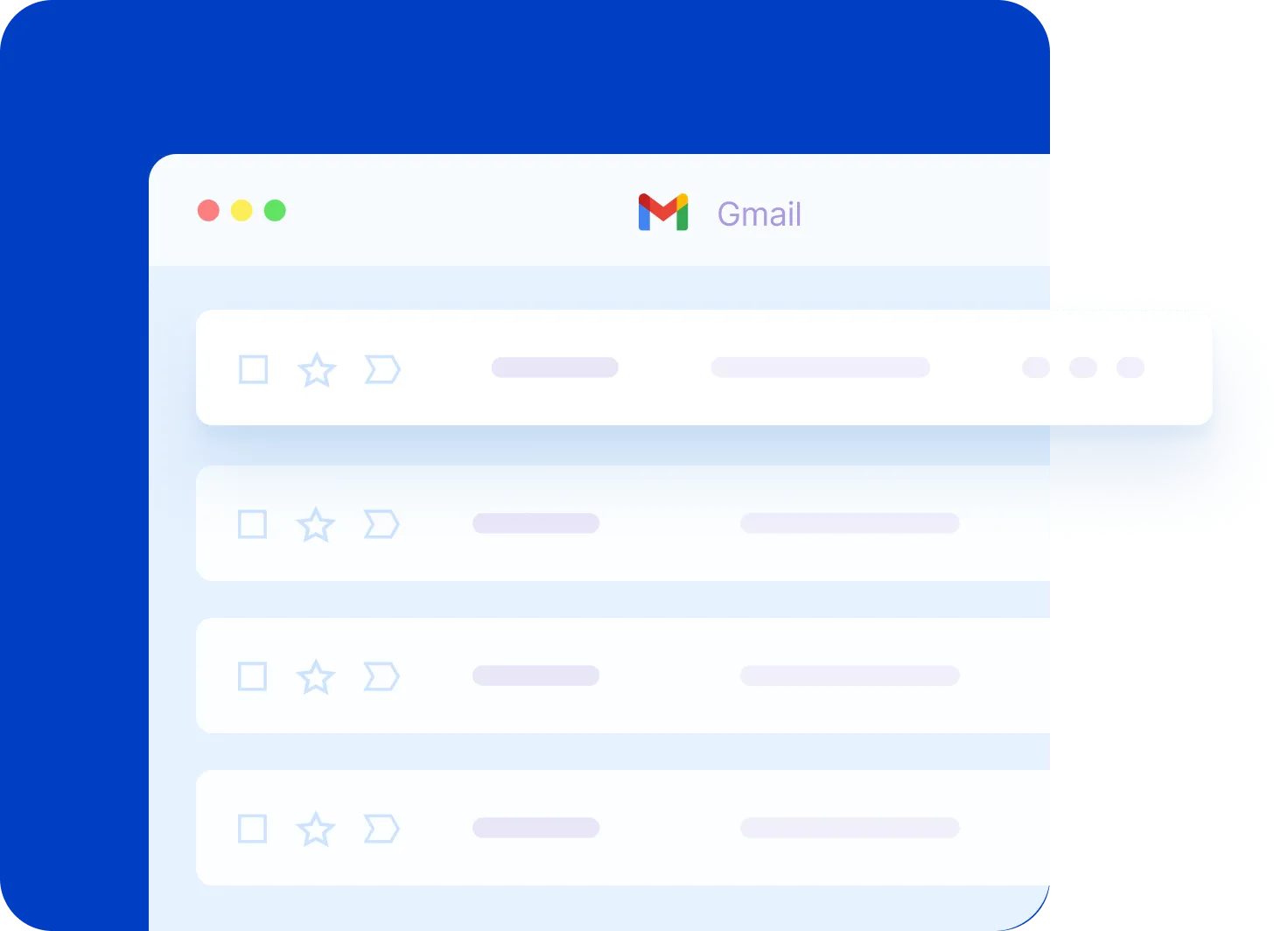
Google Calendar Essentials: Schedule Like a Pro
Are you new to Google Calendar or just need a refresher? From adding and editing events to managing multiple calendars and adjusting notifications, this video covers everything you need to know!
Google Drive for Desktop: A Step-by-Step Tutorial
Want to access your Google Drive files directly from your computer without opening your browser? In this video, I cover everything from installing the app to syncing folders and managing your files efficiently.


