


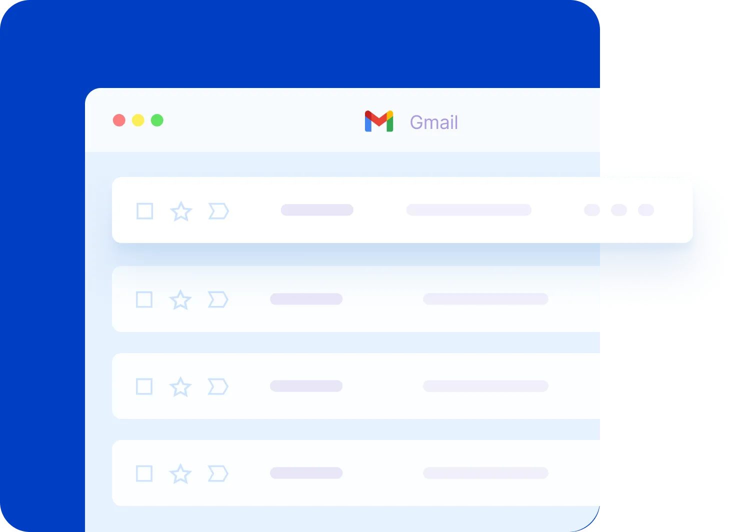
Transform Gmail into a Powerful CRM System (NetHunt Review)
At first glance, this Gmail inbox looks pretty typical. However, if I go over here and click to the left, you can see that I've transformed my Gmail into a full-blown customer relationship management system, or better known as a CRM.
In today's video, I want to show you how you can manage all of your sales, your leads, and your pipeline directly from within Gmail.
Overview
Hello everyone, Scott Friesen here at Simpletivity, helping you to get more done and enjoy less stress.
And today we are taking a look at NetHunt CRM for Gmail.
Now, NetHunt CRM is a browser extension available for Chrome, Safari, and Firefox.
And yes, the great thing about it is that it integrates directly with your Gmail system so you don't have to open up another tab, you don't have to log in somewhere else, you don't have to go back and forth between your email and your CRM.
You can manage everything right here.
But let's start off at the beginning.
And I want to go back to my inbox.
NetHunt Labels
Again, it looks a little typical here, but if I scroll up, you can see that some of my emails have some special labels.
Now don't fool yourself.
These are not Gmail labels.
These are actually NetHunt labels.
And what they're helping me to do is to identify particular emails that are related to a lead in this case, or maybe that are related to a deal in this case, which is gonna give me helpful information.
If I click on this, it's gonna take me right to that deal called Speaking Engagement.
I can see what stage it's in, the deal amount, and all of my notes directly here.
So this can be really powerful stuff as you identify particular emails to help you determine where you should be putting your focus when it comes to your sales management process.
But let's go back here to the left-hand side, and I want to highlight some of the different areas that NetHunt adds to your Gmail.
We've got things like Deals, Contacts, Companies, and even Tasks.
NetHunt Pipeline
So going back to the Pipeline, this is often the core of any sales process. We've got different phases for our sales funnel, right? We've got new or prospective clients here,
we've got clients who we are going to be presenting to, and if that's successful, hopefully we move on to the negotiation stage, and if that's successful, hopefully we win it or we might lose some as well, and we can drag those records over here. Everything is drag and drop so if I need to move this over to Negotiating, I can do so.
I'm actually gonna leave that one here for just a second. But the great thing is I can click on that, and as I just showed you a few moments ago, I've got all this information at my fingertips about this deal. Here in the Timeline area, I can see comments that have been made, I can see emails that are associated with this deal,
I can review. I can see how long has it been since I last reached out, what was the conversation we had the last time we got together. All of that information is found right here.
Contacts
Now there's also a Contacts section here within NetHunt, and you can choose to sync your contacts with your regular Google contacts, or you might want to keep them separated.
So here I've got a list of a number of my leads.
If I click on Jane, for example, not only do I pull up more details about her record, but I can see which company she's attached to.
I can also scroll down and see that, yes, she is attached to this deal as well.
And I can add specific comments about Jane or pieces of information that I'd like to include with her account.
Companies
Companies is pretty straightforward, but the nice thing is you can also see the status of each of these companies—where they are in the pipeline, whether they are a lead or an existing client, and also what their source was, where you first found this client as well.
But another big benefit is the Tasks section because more than just the pipeline, you've got specific things that you need to accomplish in order to complete or finish these deals.
So you can have a very personalized task list associated with different deals within your CRM.
Now I'm gonna go back to the inbox for just a second again because, as we're dealing with so much email and trying to cipher through what needs our attention and what can wait till later, another nice thing that NetHunt adds is the ability to follow up on certain emails.
Follow Up
So for example, let's click on this email here just as an example.
And you can see at the top we've got a couple of different icons.
Here, if I want to attach this email to a particular record, right?
If I want to attach this to a deal, I can do that by just typing in and searching for a deal right here.
But in this case, I want to follow up on this email because maybe they are a prospective client.
Here you can see this little flag follow-up icon, which looks very similar to Microsoft Outlook, but don't be fooled, this is not something that comes native with Gmail.
No, this is something that comes with NetHunt.
So if I select this, I can choose the follow-up timeframe.
I'm gonna say I should really follow up on this today.
And now, if I go over here and select the Follow-Ups menu, I've got a great summarized list of all of the emails that I need to follow up with.
I can click on it and go directly to that email, manage all of those emails.
And the other nice thing is I can hide my inbox temporarily, right?
I can just focus on these follow-up emails while I'm dealing with it.
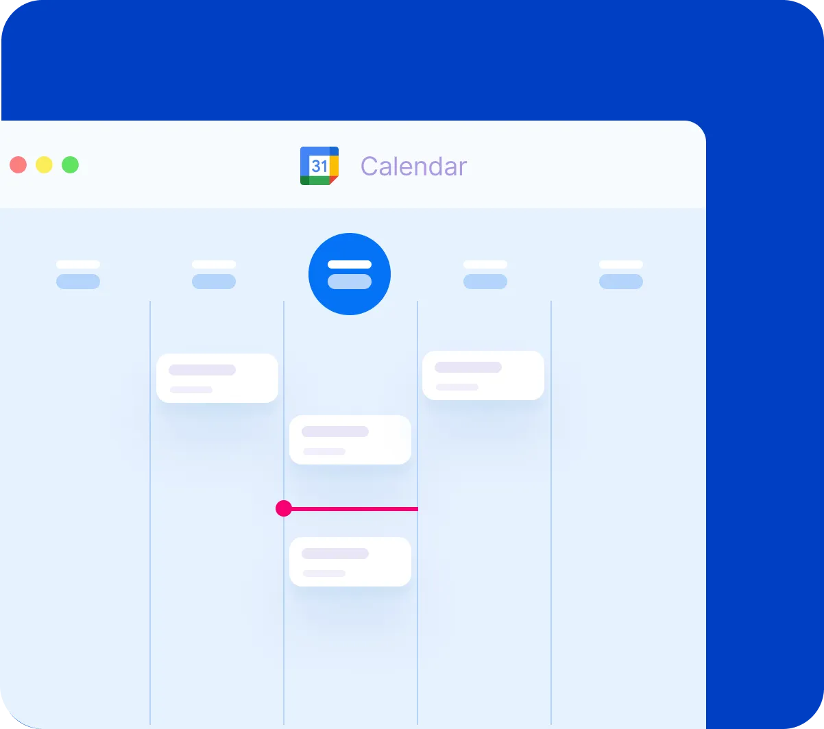
Google Calendar Integration
Now, the other nice bonus of using NetHunt is that it not only integrates directly with Gmail, but it also integrates directly with Google Calendar.
So if I switch over here to Google Calendar, you can see that I've got a couple of different meetings here, and you can see that NetHunt logo.
If I click on this meeting here called Demo Meeting, it looks pretty straightforward—it's just a calendar meeting—but if I open it up to see the details, check this out.
I've got that deal information at my fingertips again.
I can see all of this information and change this information while I'm on this call with this client.
If I select the Timeline here, I can say let's follow up with Jane in two days, right?
Like this is just a note for me.
I'm gonna hit Save.
So I can reference this.
If I scroll down, hey, there's that note that I just created.
I can see previous comments that I've added.
I can see the meeting.
And all of that information here right here from within Google Calendar.
So another nice benefit of using this NetHunt extension.
So I would encourage you to check things out.
If you are a business owner, if you're an entrepreneur, if you have some type of sales related to the way you work, you may want to check out NetHunt CRM.
Again, available for Safari, Chrome, and Firefox.
I'll leave a link in the description below so you can test it out yourself.
Remember, being productive does not need to be difficult.
In fact, it's very simple.
How to Speed Up Your Android Phone (Faster Than New)
In order for you to work at your productive best, you need your devices working at their optimal level. And so in today's video, I'm gonna show you how to more than double the speed of your Android phone. Whether it's an older Android device or even if it's a brand new phone.
Hello everyone, Scott Friesen here at Simpletivity helping you to get more done and enjoy less stress. And as you're navigating through the different apps and different places that you need to be within your phone, you may notice that there's a bit of a zoom in or a zoom out feature. And this can take as much as a second, perhaps even a little longer depending on the age of your phone.
Well in today's video, I wanna show you how to change that so you can see a drastic difference in your phone's performance. What we need to do is we need to get into Settings. Now your settings may look a little bit different than mine. I'm showing you this example on my Samsung S9 phone, but I'm gonna tell you exactly what you need to look for and where you need to go.
So within Settings, you wanna scroll most likely to the bottom of your settings, and we wanna click on About Phone. And what we're looking for is something called Build Number. Now on my device, I see a bunch of other numbers here. I see Phone Number, Model Number, Serial Number, I don't see the Build Number yet.
So what I have to do is I have to click one more level down into Software Information. And when I click on Software Information, there I can find in the middle of the screen my Build Number. Now this is where it gets really really cool. We're gonna tap Build Number seven times.
So I'm gonna go one, two, three, and after about the third one I get a message, oh I'm three steps away from being a developer. Two steps away from being a developer. One step away. On my last tap, it's gonna ask me for my PIN number. I'm gonna enter that in just to make sure. And now Developer Mode has been enabled.
You're probably saying what on earth does that mean? Well if I go back to the main Settings screen, you will see that I now have one more option below About Phone, and this is called Developer Options. If we click on Developer Options, we get a slew of really cool tools and additional things that we can do to our phone.
Now some of these things you may wanna be careful about in terms of what you want to tweak just to make sure of your comfort level. But what I'm gonna show you today is perfectly safe. We wanna scroll down until we see something that may be labeled Drawing as you see here in my settings. It may be labeled a little bit different on yours, but the key words we're looking for are anything that says Animation in the title.
And here I've got three grouped together. Window Animation Scale, Transition Animation Scale, and Animator Duration Scale. You can see that they're all set to 1x. That's their default level, 1x as in 100% or one times. Well what we can do is we can go in here and we can actually turn the animations off completely.
Let me show you how that works. I'm gonna turn off the animations for all three of these, and now when I go back and I start going back and forth between my apps, it's instantaneous. Boom, boom, boom no matter where I want to go, I'm going immediately within those apps.
Now that's the fastest that you're gonna find here when it comes to turning off animation, but that might be a little jarring for some of you. So let's go back into our Developer settings and I'm gonna set it to .5 this time around. Now remember that's still gonna be twice as fast as the default setting.
So with those three set at .5, if I go back out here, I still have that slight animation effect, but it is so much faster. And what's better yet is that you're gonna notice this speed difference even within certain apps, right? Even as you're functioning as new things are opening, as you're transitioning within particular apps, you're gonna notice it's gonna be so much faster.
So I would encourage you to turn on Developer Options and tweak your animation scale. And better yet share this with a friend or a colleague, they're gonna think it's so cool that you're unlocking a special level in a video game or you're unlocking a special code. Show them how to turn on Developer Options. You will look like an Android pro.
Thank you so much for watching today's video. I hope that you found it useful and helpful. Be sure to subscribe right here to the Simpletivity channel and remember being productive does not need to be difficult. In fact, it's very simple.
8 Trello Shortcuts Every User Should Know! (Tutorial)
No matter if you're a new user to Trello or perhaps you're an expert when it comes to boards, lists, and cards, today I wanna share with you some of the very best keyboard shortcuts so that you can do things quicker when dealing with Trello. Hello, everyone.
Scott Friesen
Scott Friesen here at Simpletivity, helping you to get more done and enjoy less stress.
If you're not familiar with Trello keyboard shortcuts, well, you are not only missing out,
but you're probably wasting a lot of time when you're dealing with your Trello boards.
Now just before we get into eight of my favorite Trello keyboard shortcuts, I wanna start off with the shortcut question mark. If you hit the question mark key,
Shortcuts Menu
Which is usually Shift + Question Mark on your keyboard,
what you're going to get is the complete list of keyboard shortcuts,
this is the official Trello list,
so that whenever you are within Trello,
you can get everything that I'm talking about here along with some additional ones as well.
So, just hit the Question Mark on your keyboard.
With that being said, let's start off with one that I use all the time.
That has to do with assigning myself to a card or perhaps removing myself from a card.
Now it can sometimes be tedious to hit this little edit icon and then go down to change members and then uncheck myself here and then I gotta hit save.
I mean, that's one way of doing it.
I could open up the card and do something similar by selecting this members version over here.
Well, why don't I do it just from here?
Why don't I do it in just single click?
Well, if you select the Space Bar, you can assign yourself.
Add/Remove You
To any card.
Look at that.
In just a single click, I'm assigning myself to these cards.
If I wanna remove myself, well, that's just a Space Bar click away as well.
I mean, how often have you had several cards assigned to you?
And you say to yourself, I no longer need to be assigned to that anymore.
Boom, boom, boom.
It's as simple as just the Space Bar on your keyboard.
Let's stick with assigning members and assigning things to maybe other people on our team.
For that, we wanna use the keyboard shortcut key A,
A as in assign.
Assign Members
So, if I hover over a card here and select A on my keyboard,
it's gonna automatically pop up the assignment dialog.
So, I'm gonna select someone else.
I can go over to this card here.
I'm gonna select A, and I'm gonna select someone else as well.
Now I've assigned people to this card.
Now there's one other thing I wanna show you here.
I'm gonna actually open up this card as an example.
This goes for almost all of the shortcuts in today's video
is that you don't always have to be at the board level view.
But when you're opening up this card,
even if you're looking at other things such as the activity down below,
if I hit A on my keyboard, it will still bring up the member assignment here.
If I hit Space Bar for example,
it's still gonna remove me.
And if I hit it again, it's going to add me.
So, you don't have to use these members and labels buttons here if you don't want to.
Almost all of these shortcut keys can be used within the card but also here at the board level view.
One last shortcut key I wanna share with you when it comes to assigning people or unassigning people
and that has to do with you want to filter out the cards that are only assigned to you.
You may be familiar by going to the menu, going to the search cards feature,
and then selecting yourself to see which of these cards are assigned to you.
But there's a much, much simpler way.
If you select Q on your keyboard,
Filter Cards Assigned to You
Q is going to quickly filter all of the cards on your board.
Here we can see there are four cards that are assigned to me.
I can toggle that back and forth as much as I like.
Here, when I select Q, I can just focus on these cards.
I can maybe work on these for the next 20 or 30 minutes or however long I'd like to work on these tasks.
If I hit Q again, now I go back to seeing every other card on the board,
so a very valuable one, the Q to filter cards assigned to you.
Well, let's move away from assignment of cards and let's take a look at labels.
I got a few different label shortcuts I wanna show you here.
Now I often get the question about Scott, how do you see the label names here.
Scott, I've seen some of your videos.
How do you actually show the label names?
You may know that, by default, we just get to see the colors on the front of the card.
If I open up this card, I can see the full name.
New project is green, and orange is client request.
But sometimes it can be very helpful to see the name right here on the board level view.
Well, if you select the Semicolon key on your keyboard, all of your labels will be expanded.
Now I can see that, new project, client request.
Yellow is medium.
Blue means HR.
If I hit Semicolon again, it will collapse everything there for me as well.
Now one thing to note is that this view does not change how other people see this board.
So, if you have other members of your team, just because you're viewing it with these expanded labels, it doesn't mean that everyone else is going to be seeing that.
So, you might wanna pass this tip along to the people that you're collaborating with or the people that you're working with within Trello.
All right.
I'm gonna hit that one more time just to collapse that label.
Let's get to label assignment.
Well, label starts with the letter L.
So, I'm gonna guess something's gonna happen when I hit L on my keyboard.
I'm gonna hover over this card, hit L, and boom,
Assign Label Menu
I've got the label assignment right here.
I'm gonna put client request on this one.
I'm gonna maybe go over here to Idea One.
I'm gonna hit L again.
I'm gonna say that this one is urgent.
Quick and easy.
Well, let's take it one step further.
You'll notice if I hit L and we bring up this menu here,
this is the default colors that when you start a new board in Trello,
you're gonna see this default order of colors,
green, yellow, orange, red, purple, and blue.
Well, I want you to remember that order because these colors correspond to the number keys on your keyboard.
One is green, two is yellow, and so on.
So, if I wanna attach the green label here, all I have to do is hit the number one.
If I wanna attach the yellow label, it's number two, and so forth.
Let's go to a blank card.
Let's go to this one over here.
Let's just go one through six.
One, two, three, four, five, six.
I'm only hitting the number keys on my keyboard.
Six, five, four, three, two, one.
You may not need to or not want to memorize all of the labels that you're using,
but particularly for those that you use frequently or that you use quite often,
that might come in handy if you are needing to change those labels on a regular basis.
All right.
The next one on our list has to do with due dates.
Due dates are so important within Trello to help us stay on task.
Due dates, that's two D words.
So, I'm gonna guess the letter D is gonna bring up my calendar.
Change Due Date Menu
Here I can change my due date or remove the due date if so necessary.
Once again, if I'm here within the card, no matter where I am looking in the card, if I hit D, I can still get that menu.
You don't have to use these buttons here on the right.
And the very last keyboard shortcut I wanna share with you today has to do with adding new cards within Trello.
A lot of you may not be familiar with this one.
You're obviously familiar with the add another card, which is at the bottom of each and every list,
but you don't even have to click that.
No matter where your cursor is, let's say I wanna add something here within progress,
as long as my cursor is below in progress,
all I need to do is select N on my keyboard.
Add New Card
And boom,
I'm gonna have a new card waiting for me to enter.
I wanna add a new card over here.
My cursor is below it.
I'm gonna hit N.
I'm gonna add a new card.
But let's go one final step further.
Maybe I don't want to add that new card at the bottom of the list.
Maybe I want it as the second from the top.
Well, if I hover over this card here and select N,
I'm gonna get that new card directly below.
Maybe I need to add something in-between these two July 12 due dates.
I'm gonna hover over this one.
I'm gonna select N.
Now my new card is ready to be entered directly below that card there,
so another tip for adding new cards here within Trello.
Well, I would love to hear from you.
Of all of the keyboard shortcuts that I showed you,
which one is your favorite, or which one are you going to start using right away?
Make sure to tell me and share with others in the comments down below.
Remember, being productive does not need to be difficult.
In fact, it's very simple.
3 Mind Mapping Tools You Should Try Right Now! (Software)
When you're starting a brand new project,
one of the best things you can do is brainstorm,
whether that's just by yourself or maybe with other members of your team.
And one of the best tools to use is a mind mapping tool.
Now, there's an awful lot of mind mapping apps and software available to you.
In today's video, I'm gonna share with you three simple tools that you can start using immediately.
Coggle
Hello everyone,
Scott Friesen here at Simpletivity helping you to get more done and enjoy less stress.
And let's get this list started off with a tool called Coggle.
Coggle, that's C-O-G-G-L-E.
Now, one of the things that you're gonna notice immediately is that Coggle is pretty bare-bones.
But sometimes that's a great advantage when you're brainstorming and thinking up new ideas.
I mean, really, a mind mapping tool should really represent like a whiteboard or a blank piece of paper.
So, Coggle is very minimal in that respect.
The other thing that I really enjoy about Coggle which you don't always get with a number of mind mapping tools is that it's actually quite nice to look at.
I actually haven't even chosen these colors that you see here.
This is something that Coggle has chosen as I've started to branch out my ideas.
And aesthetically, I think that looks really, really great, which can be important if you're gonna be working with this tool on a regular basis.
If I add something else here, it's added a nice, attractive sort of a reddish-pink hue here as well.
But another feature that I like about Coggle is that not only can you collaborate with others,
you can share this so that other people can join and start to brainstorm as well,
but you can have a full conversation.
So it does have a discussion window here.
Here you can see I'm already asking some questions.
You know, what do other people think about the t-shirt ideas, and so forth.
This, I think, is a great feature for any mind mapping tool.
Mind Meister
Now, moving on,
the second tool I wanna share with you is called MindMeister.
Now, MindMeister is also, you know, relatively simple to drag and drop and add things around.
If I wanna add some more ideas here to "Book,"
all I need to do is hit tab on my keyboard.
And maybe I'm going to consider writing a self-help book.
Maybe I'm going to consider writing a cookbook.
Who knows, and if I wanna highlight some of these things,
MindMeister gives me a lot of options here as well.
If I want to add little icons,
if I want to change the color,
or the appearance,
or the size of some of my branches,
very easy to do.
In fact, one thing that I found very, very simple with MindMeister is that if I've grouped something in a different branch,
but then I want to either merge it or bring it somewhere else,
so here, for example, I've got "Poster,"
I've got something labeled "Bumper."
Well, I think I meant that for the "Stickers" branch over here.
All I have to do is click on "Bumper,"
and I'm going to touch it to "Stickers,"
and now it's brought "Bumper,"
along with the things that have proceeded it here with "Small" and "Large" over on this side of the mind map.
So, you know, very intuitive,
very easy to use,
things that are very, very important when you're selecting a mind mapping tool for yourself.
Drawio
Now, the third and final one on our list today is called draw.io.
And one of the things about draw.io is you don't even need an account to start using it. All you need is to go to the website, and you can immediately start creating a flowchart.
And you can save it either to your cloud storage, or you can save it to the computer that you're currently working on.
Now, I know draw.io may look a little more intimidating compared to the previous two tools that I just showed you, but don't let this screen look too intimidating. It's actually a lot easier than you think.
You know, here, if I want to add something new to this branch, all I need to do is click on that arrow, and now I can start adding a new idea over here.
Very much the same or similar functionality that we saw in the previous two tools.
Now, The nice thing about draw.io is that it's really optimized if you're wanting to create a flowchart, for example.
So, we've got some of the more common shapes here that you may be familiar with if you're in need of using flowcharts.
It does have a few more advanced features.
And another nice thing is that draw.io is really optimized if you decide to print out your mind map.
Or at the very least you may want to save it as a PDF.
So, that can be very helpful if you choose a particular paper size here, and if you want to share your mind map in that fashion.
So there you have it, three recommendations for some very simple yet powerful mind mapping tools.
Now, I'd love to hear from you next. What are some mind mapping tools that you have used or that you would recommend to others?
Be sure to share your thoughts in the comments down below.
Thank you so much for watching today's video, and remember, being productive does not need to be difficult. In fact, it's very simple.
Time Blocking with Google Calendar (Tutorial & Tips)
Time blocking can be a very effective way to manage all of the things that you have to do in a given week and it can also give you the added benefit to make sure that you have a balanced week between your work life, your personal life, and other things that you're responsible for.
So in today's video, I'm gonna show you exactly how to effectively time block within Google Calendar.
Hello everyone, Scott Friesen here at Simpletivity, helping you to get more done and enjoy less stress.
And let's get started off with just a quick definition of what is time blocking.
Well, essentially, time blocking is all about putting things that are not appointments or meetings onto your calendar.
Your calendar probably already looks a little bit like what I've got here in my example.
I've got a variety of meetings. I've got interviews. I've got things that I actually physically have to be a part of or maybe a phone call that I need to participate in, but sometimes it can be very effective to put in tasks as a part of our calendar as well.
Let's say that there is a report that I've just been deferring all week long. I've just never found time to write this particular report.
Well, if I need to get it done before the weekend, a very effective thing to do would be for me to come in here, create an event and just say write the report.
I wanna block it out. I wanna make sure that I don't have any other meeting, anything else that conflicts with this time so I can get this task done.
However, you can see that this task looks very much the same as to all of my other appointments, all of my other meetings on this calendar.
Now I could go in here, I could edit it, and I could change the color if I wanted to.
I can make it green for example so it's gonna stand out a little bit here.
But we are using Google Calendar so there is a much more effective way to do time blocking within Google Calendar.
So let me delete this example here and the very first thing I'm gonna do is I'm gonna come over here to my calendars and I'm gonna create a few different calendars for the different types of tasks, the different aspects of my life.
Now you'll see here the very first one is my default calendar. It's called Scott's calendar.
This is the one where people are using my primary email address.
They're inviting me to meetings and appointments and I'm doing the same.
All of these things here are part of my default calendar.
And the next two below I've unchecked, these are reminders and tasks which are built right into Google Calendar, but I'm not gonna make use of them as a part of today's example.
What I wanna do is I wanna create a few additional calendars.
So I'm gonna go down to other calendars and I'm gonna hit the plus button and I'm gonna say create new calendar.
Now the first one I'm gonna select or create is gonna be called work.
This is where I'm gonna be putting work tasks. Not work meetings, but work tasks.
I'm gonna hit create calendar and the nice thing is it is actually gonna keep us in this menu.
I'm gonna add a few additional calendars here all at the same time.
I'm gonna add a personal calendar for some personal activities.
I'm also going to add a, sometimes it takes a second, I'm gonna add an exercise calendar, making sure that I fit in enough exercise as a part of my week.
I'm gonna add one more in my example. This one I'm gonna call travel and you'll see I'm not gonna use it for things like my commute, but I'm gonna use it for things that maybe I don't usually travel at a certain time of day or a certain distance and I'm gonna put that in.
So now under my calendars, you can see that I have them listed here.
Now Google Calendar has chosen a bunch of very similar colors here so I'm gonna go in and change this.
I'm gonna change travel to maybe more of a blue color, work I'm gonna change to let's use like a green color.
It's nice to have some different shades in here. There we go.
It's gonna be a bit easier to see the differences between my calendars here.
So let's go back to that first example where I need to write a report.
Again, I'm gonna do it here between 9:00 and 11:00 so I'm just gonna click and I'm gonna drag and when I release, the first thing I'm gonna do even before I add the title, I guess it doesn't matter which order you do this in, I have the tendency to come down here.
I'm gonna select the activity first.
This is a work activity so I'm gonna say work and I'm gonna say write the report just like we did before and I'm gonna hit save.
Now not only do I have the different color, but it's actually a different calendar.
Let's have a few more examples just for fun here.
Maybe let's say the first thing I need team meetings may be the first thing on Monday, but I got a lot of email that's gonna be coming at me on Monday morning so I'm gonna say process email.
I wanna get through all of that email first thing Monday morning.
So that's another work activity. I'm gonna hit save there and maybe let's add one more thing.
Maybe I'm gonna review. I'm interviewing a candidate on Wednesday so I'm gonna say over here on Tuesday afternoon I'm gonna say review job applicant, their application there.
And again, that's gonna be a work activity and I'm gonna hit save.
So right away I can tell just at a glance that these three items are different.
I don't have to physically be somewhere.
I don't have to call in to a conference call.
These are work-related tasks and they show up very differently than my other appointments here.
Let's try and fit in a few other things as a part of our day.
Exercise is very important and I like to go for a run on a regular basis so let's put in some exercise here for Monday, Wednesday, and Friday.
I'm gonna come up here. I'm gonna start again. I'm gonna say go for a run.
This time of course I'm gonna change it to exercise and I'm gonna make this one recurring.
Actually, it's not a full hour. It's just a half-hour run.
I'm gonna go into more options and I'm gonna go down to my repeat option here.
Instead of does not repeat, I'm gonna say, it's none of these so I'm gonna say custom.
I'm gonna say Monday, Wednesday, and Friday and I'm gonna say done.
I'm gonna hit save and now you can see, this is gonna go on beyond just this week Monday, Wednesday, and Friday.
And let's say on Thursdays I get together with some friends and in the late afternoon we play some pickup basketball so I'm gonna put that one in here on Thursday afternoon.
I'm gonna pick exercise so I can see that it stands out.
Again, the nice thing is that I can get this overview of not only when these things are happening, but am I fitting in enough exercise as a part of my weekly routine.
All right, obviously, there's gonna be some personal activities and maybe I've got a lunch scheduled with a friend on Tuesday.
So I'm gonna come in here, I'm gonna say lunch with Jane and we're gonna change that to personal.
It's not work related or at least not directly related to my work so I'm gonna put that as a personal activity here.
And then maybe on Wednesday night I've got dinner with friends.
So I'm gonna put that one in here, again choose the correct calendar and hit save.
So I've got a few personal things that stand out as a part of it as well.
And the only other calendar that we haven't used in our example is travel.
In this case, I'll usually use something like this not for my everyday commute.
Not for the things that I'm doing on a regular basis.
But let's say I've got this community breakfast.
This is an early breakfast and I need to travel downtown to attend.
So this is different than my other days.
So what I'm gonna do here is at 6:00 a.m., I'm gonna say leave for downtown and I'm gonna put that to my travel calendar.
So I want it to stand out a little bit more here.
I wanna make sure that I fit that in, that oh yeah I gotta get there by a certain time.
Sometimes another way that I'll use a travel calendar is that if I'm leaving for like the airport for example.
I know when I need to be at the airport. I know when my flight is leaving, but sometimes we don't calculate how much time we need to give ourself to actually get to the airport.
So maybe I'm leaving for the airport on Friday afternoon.
I need to be at the airport at 4:00 so that means I need to leave my house at about 3:00.
So here I'm gonna say leave for airport and again we're gonna choose that travel calendar.
So again, I've got that built in. I know when I should be jumping into my car and leaving for the airport.
So it does look like a bit of a kaleidoscope, a bit of a rainbow I guess you could say here of different activities here, but the other nice thing about Google Calendar in separating out your activities by different areas in your life is that you can of course hide and minimize and just focus in on certain activities.
So let's say I just want to hide my work activity.
I'm gonna hide my work calendar and my work tasks.
I can take a look and say okay, I'm gonna get my exercise in this week.
Here's when I need to pay special attention of leaving.
I've got lunch with Jane and dinner with friends.
That's nice. Maybe there's something else I should fit in there just for me or maybe there's something else I should reach out to a friend.
This is where sort of that balance comes into play as you can zero in on different activities.
Let me enable some of these other calendars again and I wanna show you one more tip which you may think is just for fun but I actually think it can be very effective.
Of course, the colors help things to stand out from other calendars and other events in your time blocking calendar, but there's one other way that I sometimes add, an additional way to make things stand out and that is by adding emojis.
And no, I'm not kidding.
I use a website called Emojipedia on a regular basis.
And you can just search for emojis as you want.
So in this example, I'm gonna go grab this man running emoji.
I'm gonna select copy which just copies it to my clipboard and I'm gonna go back up to this recurring run event and I'm gonna hit edit and at the very beginning of it, you can do it at the end as well, but I'm gonna paste it in there.
I'm gonna hit save. I want it to be applied to all of my events.
And so now, it may be a little hard to see with that purple background.
I can always change that color of course.
I've got this little sort of running man out in front which again sometimes just makes it stand out that much more than everything else on this screen.
So I hope you found this video helpful as you consider time blocking within Google Calendar.
I would love to hear from you next.
Do you have additional suggestions as to how to time block within your calendar?
Or do you have further questions about how to effectively time block within Google Calendar?
Make sure to let me know down in the comments below.
And remember being productive does not need to be difficult.
In fact, it's very simple.
How to Use Checklists to Free Up Your Mind (Tips & Tricks)
Here on the Simpletivity channel, I talk an awful lot about to-do lists and it's very true that a to-do list is a type of checklist.
As you're going through your day, you're checking things off or striking things through.
But today I wanna talk about recurring checklists.
These are checklists that you can use on a recurring basis and are gonna help you so you don't have to remember certain things as a part of your day.
Welcome
Hello everyone, Scott Friesen here at Simpletivity helping you to get more done and enjoy less stress.
And I wanna give an extra big thanks to Rob Joseph for today's video.
Rob gave me the suggestion for focusing in on checklists opposed to just to-do lists.
Checklists we can use on a recurring basis.
Travel Packing List
So let me start off with an example of a checklist that I use on a regular basis, and that is my travel packing list.
Here you can see I've got a variety of things, a lot of them are clothes, but it also includes some things like my passport, my earbuds, and maybe both my dress shoes and my sneakers.
Now here's the thing, I actually travel quite frequently and, as a result, you know, I pretty much know this list very, very well. Most of the time I probably don't even need to refer to this list.
And you probably have other activities in your life in which you've done them so often you think to yourself, "I don't even need this checklist."
Well, I might argue that's precisely the time when you need the checklist because when we start to feel a little confident, that's exactly when we forget the tie and oh no there's gonna be a formal function at this destination.
Or oh no, I forgot my sneakers and I do want to go for a run.
That is the great power in using checklists. You don't have to store this information in your head at all. You can just refer to the checklist when you're doing certain activities.
End of Work Day Checklist
So let's take a look at a few other examples that I have here.
The checklist that I have here is called an end of work day checklist and this can be great if you want to end your day on a positive note and maybe make sure that you don't forget anything or that you've crossed off a few things on a regular basis.
So I've got a few examples here including reviewing my inbox to make sure that there's nothing urgent that I can safely ignore my inbox or ignore email for several hours. Maybe I want to check to make sure that there's no remaining voicemail on my phone. Perhaps you've got an activity, something that you need to send to someone else or something that you need to update on a regular basis. So in my example I've got send new leads to Sales Manager. And then reviewing my schedule for tomorrow and reviewing my to-do list as well.
The other nice thing about using a checklist like this is that we don't skip over anything or we don't rush the process. If you know when you created the checklist or when I created this checklist that these are good things. These are things that I really should be doing in the last 10 minutes of my day. It's great to be able to run through them and just check them off as I go.
Now, in today's example I'm using Google Keep to show you these checklists but of course you can use a checklist in almost any other tool. Whether you use Keep or Trello or Evernote or Todoist, hopefully your project management tool or your to-do list app has the capability to have a checklist.
And the other nice thing in most of the apps and technology that we use, here you can see I've crossed everything off of my end of workday checklist, what I can do is I can actually go down here and just say uncheck all items so when I'm finished I can say uncheck uncheck all items and now I'm ready for tomorrow. Now I'm ready to use this checklist again in the future.
Let me show you two other quick ones here.
Weekly Review Checklist
I've got a weekly review checklist.
Especially if there's something that you don't do daily. Maybe this is something I only do once a week, maybe you've got a monthly review or a quarterly review.
You can put it all here within a checklist. Make sure that you don't forget any of those steps.
And keep in mind these are living, breathing documents or checklists. These are things where you know I might add a few things over time and I might remove, or revise, or adjust a few things over time as well.
Morning Routine Checklist
The last checklist I wanted to show you here is entitled "Morning Routine" and hopefully you've got some kind of routine, and well we all have some kind of routine but hopefully you've got a productive and a positive routine built into your day.
So how are you gonna start your day so you can set yourself up for success? And you know over time I might adjust things here. Maybe I want to review my schedule for the day after I come back from my run or after I have my breakfast, or something along those lines.
Maybe over time I realized you know what, I don't want to do this at that time, I don't want to do it at all. That's fine, I can remove it from this checklist.
I think this is especially important when you are starting a new routine or you're starting a weekly review or whatever it is to have some type of checklist so you can save your mental energy for more important tasks and for more important activities.
Conclusion
So I hope I've given you a few ideas of how you can use checklists in your day.
If you're already using a checklist, I'd love to hear from you and I would invite you to share it with us in the comments down below.
I know there's gonna be many others who are going to be excited to see some of your checklist ideas and how they help you to stay productive.
And if not, hopefully I've given you some new ideas on how you can include checklists in as a part of your day.
Thank you so much for watching. I hope you subscribe right here to the Simpletivity channel and remember being productive does not need to be difficult. In fact, it's very simple.
To-Do List Overload! How to Manage Too Many Tasks
Oh my goodness. Have you ever sat down with your to-do list and felt overwhelmed with the large number of tasks that you have scheduled for today?
And, in many cases, it's a result of you deferring tasks from previous days. In the example that I have here, it's a Monday morning, and I've got way too many to-dos than I'm going to be able to accomplish today, especially when I look down at my calendar and see the number of meetings.
So what am I going to do to prioritize this list, and make sure that I don't have this problem, or at least reduce this problem, for the remainder of the week? Well, that's what I'm gonna show you in today's video.
Hello everyone, Scott Friesen here at Simpletivity, helping you to get more done and enjoy less stress. And today, I want to show you both a simple but a fun way to prioritize your list so you can focus on what's most important to you.
So, whether you manage your to-do list on a piece of paper, whether you use a calendar like I'm showing here, or maybe you use some other to-do list app, you've probably found yourself in this situation.
Now, I could go ahead and maybe defer half of these things to tomorrow, but I've probably already got a number of tasks waiting for me tomorrow. That's one of the reasons why I prefer a week-view of my tasks. So I'm just gonna change that here within my calendar so I can see the rest of the week.
And sure thing, I've got four other tasks already scheduled for tomorrow, so if I just go and defer half of these tasks, I'm only gonna have the same problem again tomorrow.
So today, we're gonna use a bit of gamification. Yeah, we're gonna have a little bit of fun as we prioritize this list. And step one is by picking a hard number. What do I mean by a hard number? Well, in this case, I'm gonna pick the number five, and I'm only going to commit to accomplishing five of the tasks that are already slated here for my Monday.
Now, the reason for doing so is that I want to force myself to ask some hard questions. What is most important? What is most valuable to me? What should I really be focusing on so I can defer the other things in my list?
I need to remind myself, and you may need to remind yourself, that there are no two things which are exactly equal on your to-do list. Something is always going to be more important than something else. So, in this case, we're gonna pick the number five.
Now, you might wanna pick the number three, or maybe pick the number seven. I would recommend not going any higher than perhaps seven tasks, 'cause the other part of this system is that you want to have the positive effects of saying, "You know what? It's only five," or, "It's only seven things that I need to focus on today."
You wanna have that positivity to give yourself the motivation to accomplish all the things in your tasks. So, I'm gonna commit to doing five, and I'm gonna defer the remaining four on this list somewhere else this week.
But here comes the second step of the process. Instead of just deferring them all to tomorrow, or just sort of blindly deferring them, I'm gonna add another step to this method, another step to this gamification, and in that, I'm only gonna commit to deferring something to one of the following days.
So that's right, I've got four tasks which I need to defer. If I defer something to, let's say the 7th, well then the 7th is taken. I can't defer anything else on this list. I'm gonna have to pick one of the other days this week. What that's gonna do, is that's gonna help me continue to ask the hard questions about priority. What should come before something else? Or what's more important than something else?
But it's also gonna disperse this out a little bit so I don't have this same problem of having 10 or 15 or 20 things show up on a particular day. So, let's get going. I'm gonna get started, and I'm gonna start looking at the things that are, perhaps, the least important, right? The things that I can defer.
So, updating my LinkedIn profile, not that important. I'd like to do it, but it's certainly not urgent. I'm gonna take that one, and I'm gonna put it on Friday the 9th. So remember, the 9th is now taken. I can't defer anything else to the 9th, 'cause I don't wanna heavy-load my Friday or heavy-load a particular day. I might wanna just jot it down on a piece of paper if I need to remember, but it's pretty simple as a part of today's example.
All right, let's look at what else we've got on this list that I don't really need to do today. Pick up my new phone case? Certainly not something that I need to do today. And you know what? Since I have my calendar open, I notice that I'm having lunch with Julie. That's right next door to the store, right next door to the store where I'm picking up my case. So I'm gonna move that one to Thursday, okay? I can pick that up when I'm out of the office.
So 8th and 9th are taken. Now I'm gonna focus on the 6th and the 7th. Well, creating the monthly email newsletter is something I need to do this week, but I certainly don't need to do it today. I'm gonna move that one out to the 6th.
And that means I've got one more spot here on the 7th. What don't I need to do today? Something that I could push off. You know what? Review all of my social media comments. Certainly don't need to do, that's not urgent. So I'm gonna push that one out to the 7th.
Now I've got five things. I've got five things that are much more important than the things that I've deferred. I've got the positivity, I've got the motivation, to knock off these five things even if I'm having a rough morning. You know, I've got all these meetings. I can say to myself, "You know, it's only five. It's only five, Scott, that I need to accomplish today."
And here's the additional benefit. If I get to, let's say the mid-afternoon, or even the later part of my day, and I have accomplished all five things on my list, there is something so gratifying to look ahead and start to knock off things that I didn't even plan to get done today, things that are now scheduled for tomorrow. There's something very gratifying, very satisfying, of taking things off of this list, can make you feel even more productive, and also leave work or leave your office with a smile on your face.
So, if you're confronted with an overly long to-do list on a particular day, try a method of picking a hard number such as five, focusing just on five, and then deferring the remainder of your tasks, and using the limit of only one day for the following days ahead so that you can disperse your tasks along here.
And already you can see that the rest of my week is a lot more manageable as a result. Of course, other things are gonna be added to this week, but it's a lot more manageable as I manage those tasks going forward.
Thank you so much for watching today's video, and I would love to hear your comments and your questions on this fun and productive method. Remember, being productive does not need to be difficult. In fact, it's very simple.
Decision Matrix: How to Choose Which Project to Work on Next
How do you decide which project you should be working on next, especially when you've got so many great ideas bouncing around in your head?
Well, in today's video, I want to show you a very simple tool to help you make the best choice. But first, I'd like to thank today's sponsor, Hygger.
Hygger is the project management tool which allows you to manage all of your tasks in any way, and in any view that you like. But what really sets apart Hygger from other software tools is its ability to prioritize. Do you want to view all of your tasks on a value versus effort matrix? Or perhaps you prefer the Eisenhower matrix and view all of your tasks from an urgent versus an importance category?
If you'd like to try Hygger for yourself, be sure to click the link in the description below.
So let's get some help on deciding which project we should start next. A number of years ago I read a book called "The $100 Startup." And near the very back of the book it included a Decision Making Matrix.
I decided to create my own matrix in a digital format so I could repurpose it, and I could also have it sum up some of the math and some of the numbers automatically.
Decision Matrix
So, how does the Decision Making Matrix work? Well, here on the left-hand side we have a number of different ideas, and these represent projects that I'm seriously considering undertaking in the coming year.
Now, it's best when using such a matrix to have probably a minimum of three different projects to evaluate, and probably not a lot more than maybe five or six. You don't want a huge list here; hopefully, you've already narrowed it down to maybe roughly four or five.
So I've got things like updating my website, building a new product, hiring more staff, buying a new customer relationship management system, and also writing a book.
And then in the next four columns, we have the different criteria in which we are going to be evaluating these projects. So first, we have impact. So how much of an impact will this project make on my business or my customers? And I have a nice little key here down below which gives you a description of each of these four criteria.
By the way, if you would like to use the Decision Making Matrix and use this for yourself, be sure to click the link in the description below, where you can have access to this exact sheet.
Now the second one has to do with effort, in terms of how much work and time is it going to take me to complete this project? And of course, we want to look at it from a scale of one to five in terms of what's going to cause a ton of work; we're going to give that a score of one all the way to five, which is going to cause very little work, almost no work. And as you can see here in the key down below, everything is going to get a value between one and five.
So let's continue on with profitability. Of course, that's important for any business or organization. Relative to the other ideas, how much money will this project bring in? So I'm going to start inputting my values, but just before I do, I want to give you one other handy tip that I typically use when I'm engaged with the Decision Making Matrix.
Of course here you can see that I've got an active total, which is automatically summing up these numbers here in the row to the left. But I don't want to be skewed by these numbers; I don't want to be influenced, negatively or positively influenced, by these numbers. So often what I'll do is I'll come up to this column here, and if I select the down arrow, I'm going to say hide column. And this can be very effective to hide that total column while I'm inputting these numbers. And it also makes it a little special for a big reveal at the end.
All right, so with profitability, updating my website, I'm going to give that maybe a two, might bring in a little more money. Building a new product definitely has more potential, so I'm going to give that a four. Remember, the higher the number, it's going to have the potential for the more amount of money to bring in for my business. Hiring more staff, maybe a three. Somewhere in the middle of the road. Buying a new CRM system, I'm also going to give that one a three. And writing a book, it certainly has the potential for more profitability, so I'm going to give that one a four in this particular case.
Now the last criteria that we want to use here is called vision. And this is something that I think we sometimes forget. Do these projects align with your business's mission statement, or the values that you have for your business? Or if these are personal projects, do they align with your personal beliefs? Right? Or your personal ethics?
So let's start off here with updating my website. It's sort of middle of the road, I think I'm going to give that maybe a three. Building a new product certainly does align with my vision, I'm going to give that one a four. Hiring more staff, though I do value a better work-life harmony, I'm going to give that one about a three. Building a new CRM system, yeah, it's important, but I'm going to give it a fairly low ranking. It's not really in line, there's nothing terribly special about that with the vision. And then writing a new book, you know, I might give that one a much higher one here. So I'm going to give that one five. Because I want to get my message out there, that's definitely in line with my vision.
Results
So now that I've given everything a score amongst these four criteria, let's go and reveal the total.
So if I go up here and hit this arrow, it's going to expand, and now I've got, oh interesting. I've actually got a tie. A 15 between building a new product and hiring more staff. And then on the opposite end, you can see that updating my website got a score of only nine.
Now, as part of a next step, it doesn't mean that I'm automatically going to engage with both of these projects. But what's so helpful about the Decision Making Matrix is that this is going to help me make the best decision. Maybe I love updating my website, and I get excited about that, but the Decision Making Matrix has told me that that's perhaps not the best use of my time right now. Especially compared to building a new product, or hiring more staff.
Again, if you would like to use the Decision Making Matrix, be sure to click the link in the description below, and plug in your own projects and see what you should be working on next.
And of course, I'd love to hear your comments and any of your feedback as to how you decide on which project you should be working on next. Remember, being productive does not need to be difficult. In fact, it's very simple.
How to Get Someone to Reply to Your Email
Today's video was sponsored by SaneBox. SaneBox is the easy and all-in-one tool to help you keep your email inbox clean.
Now, at its core, SaneBox is about filtering, and it uses powerful algorithms to help you filter out unimportant email, so you can focus on what matters most. But some of my favorite features of SaneBox are its smart folders, things like SaneLater, which automatically moves distracting emails into a folder I can review at a later time, or also SaneNoReplies, which helps me to track and notifies me when someone doesn't reply to one of my emails.
And of course, all of these folders are smart. And so, it learns from your behavior over time, but of course you can make changes along the way so you can tweak SaneBox to get the most out of your inbox. If you'd like to learn more and try SaneBox for free, be sure to click the link in the description below.
You have a lot of email to write today. And many of those emails include questions in which you are wanting a response. So, how can you increase your chances of getting a reply to your emails? Well, that's what I'm gonna show you how to do today.
Hello everyone, Scott Friesen here at Simpletivity, helping you to get more done and enjoy less stress. And today I wanna share with you four tips, four steps to help you increase your chances of getting an email reply.
And we're gonna get things kicked off with, of course, the subject line. Now, sometimes we are too brief with our subject line. And you wanna make sure to take just a few seconds to make sure that your subject line is optimized. Because if someone doesn't open up your email, well, you can guarantee you're not going to get your response.
So, two things to keep in mind with your subject line, number one, you wanna be specific so that the person receiving your message knows exactly what you're talking about or can guess what the contents are gonna be within that email.
But the other thing we wanna keep in mind is to keep our length in check. Studies would show that the optimal length of a subject line is somewhere between three to seven words.
It's hard to be specific with just one or two words but because we are dealing with emails so often on our mobile devices, we wanna keep it to seven words maximum so that the person reading it can see the full subject line and not get things hidden and again decide to move on to something else.
In my example here, I'm gonna be replying or sending an email to someone that I've already had a previous conversation with. I'm gonna be sending them a pricing quote or actually I'm gonna be following up with them about a pricing quote. So, my subject line is going to read Pricing Quote for Productivity Workshop. Oh spell it right there. So, very detailed of course here. It's about the workshop, and it's about a pricing quote. So, when the person receives this, they're gonna know exactly what I'm talking about, and I'm within this three to seven-word limit.
Now moving on to the body of the message itself, now depending on who you're speaking with, the topic, and so forth, I could go through so many different examples here. You're gonna know how to write the optimal message, at least what words to include within your message. But just like we saw that there was an optimal length for a subject line, studies have also shown that there's an optimal length for the body of your email message. That's somewhere 50 and 125 words.
Now keeping your message below 125 words probably makes sense. You wanna get to the point so that that person doesn't have to sift through three or four paragraphs to find out what you're asking or what you're needing. But you also wanna make sure not to be too brief because when we send emails that are only one or perhaps two sentences in length, studies have also shown that people sort of scoff at them and they don't consider them very weighty or that they are very important.
If it's just one or two sentences, maybe this could have been included in a text or instant messaging. Often, we won't give them the weight that they deserve. So, you wanna shoot for about a 50 word minimum but also 125 word maximum.
Now I'm not gonna get into the details of the contents of my message because of course each and every email is unique. But tip number three has to do with the question itself.
Here you can see at the very end of my message, I said, "Can we set up a call for Thursday to discuss in more detail?" My tip for you here isn't so much to do with length but the placement of this question. Sometimes when you've added the question in the middle of a paragraph or even at the end of a short paragraph like this one here, it can get lost in the mix.
So, my tip for you here, whatever that key question is, is to put it on a separate line, a distinct line within your email. The reason being, is that it's so much easier to see. In fact, when this person first opens up this email, they may actually see this question mark in the corner of their eye even before they've started reading the entire email itself.
So, I have found it very, very effective to put your question on a separate line. You can catch them up to speed up here. You can give them some other content or backstory here. But when it comes to that key question that you're asking, try putting it on a separate line. It just makes it stand out that much more. Studies have also shown that we tend to reopen and touch an email multiple times.
And so, instead of getting caught up to speed as to what is the question or what do I need to do with this email, make it easier for the receiver that they can see that question on that separate line.
Now I could hit send at the point and hope that I get a reply to this email. But there's one final step, one final tip I wanna share with you, and that has to do with your sign-off. Now sometimes we sort of scoff and don't think that sign-offs means a great deal, but there's a lot of interesting research that would tell us otherwise. Some people might say things like cheers or take care or maybe even thanks. Thanks isn't too bad. It's polite. That can often increase your chances.
But let's go one step further. We're gonna put thanks in advance. Again, some pretty interesting research has shown that thanks in advance will greatly increase your chances of getting a reply. Of course, none of this is going to guarantee a reply, but there's something about thanking someone before they've actually done the request or before that they've answered your question.
It makes the person who's receiving this email almost feel obliged to send you an answer or to send you a request. So, you may want to experiment with including thanks in advance as a part of your sign-off.
So, in quick review, tip number one, in the subject line, let's be specific and keep the word count between three to seven words. Tip number two has to do with the body and keeping our message between 50 and 125 words. In fact, here in Outlook, I can go up here and click on the Word Count. Look at that, 63 words. I'm definitely within that particular range.
Tip number three has to do with the question and try putting it on a separate line. It makes it punch out and make it a little more distinct, easier for the reader. And last but not least, our sign-off, thanks in advance, helping that person to hit the reply button and give us an answer or give us a reply to the question that we've been asking here.
I hope you enjoyed today's video. I'd love to hear your questions and further comments about getting replies within an email. Remember, being productive does not need to be difficult. In fact, it's very simple.
Featured Videos: Get Organized Today
Mastering Gmail: How to Add Notes & Due Dates
Unearth the secrets of Gmail to transform your email management. This video uncovers a special tip that most Google users don't know but will change the way you look at your inbox.
Google Calendar Essentials: Schedule Like a Pro
Are you new to Google Calendar or just need a refresher? From adding and editing events to managing multiple calendars and adjusting notifications, this video covers everything you need to know!
Google Drive for Desktop: A Step-by-Step Tutorial
Want to access your Google Drive files directly from your computer without opening your browser? In this video, I cover everything from installing the app to syncing folders and managing your files efficiently.
